I was looking back through my blog and realized that some of the blog challenges I participated in helped shape my style…or at least my typical go-to style. That’s one thing I really love about having a blog…looking back at the massive number of creations over time.

SOC: Charcoal Grey & Pale Pink
7/2/2013
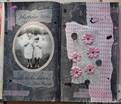
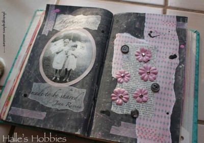 So here we are at week 4 of The Summer of Color with Charcoal Grey & Pale Pink. A much easier set of colors for me.
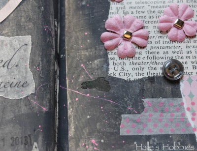
I had a bit of a hard time getting the right grey until I read on Elizabeth’s post that she puts a little purple into her grey’s to give it more intense color. It worked!! So happy….thanks E!
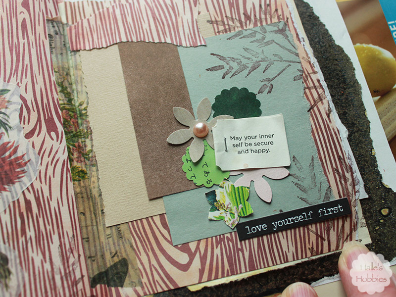
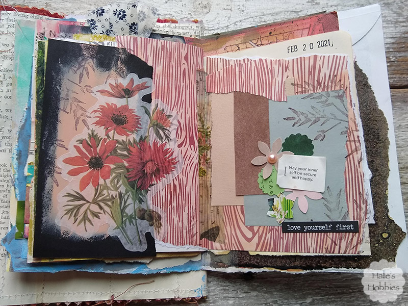
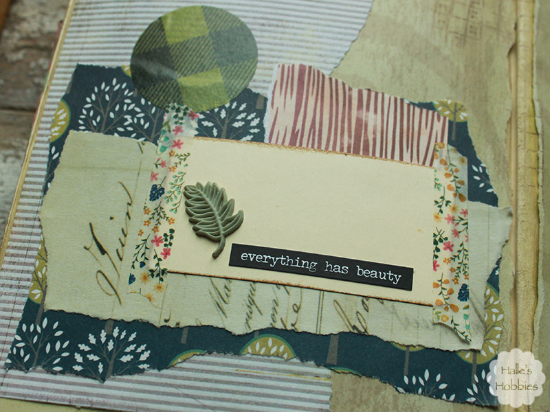
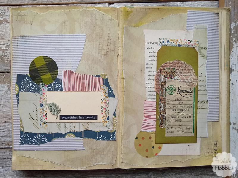
I’ve been doing a lot with splattering paint and inks lately. It seems to add the texture I’m seeking.
I have to admit that this shot with those colors makes me think 1980’s…”like totally“. There are parts of the 1980’s worth reliving…
I’m also loving the texture I pressed into the grey. I was actually trying to stamp some black texture into it but the paint was still too wet. I decided to run with it.
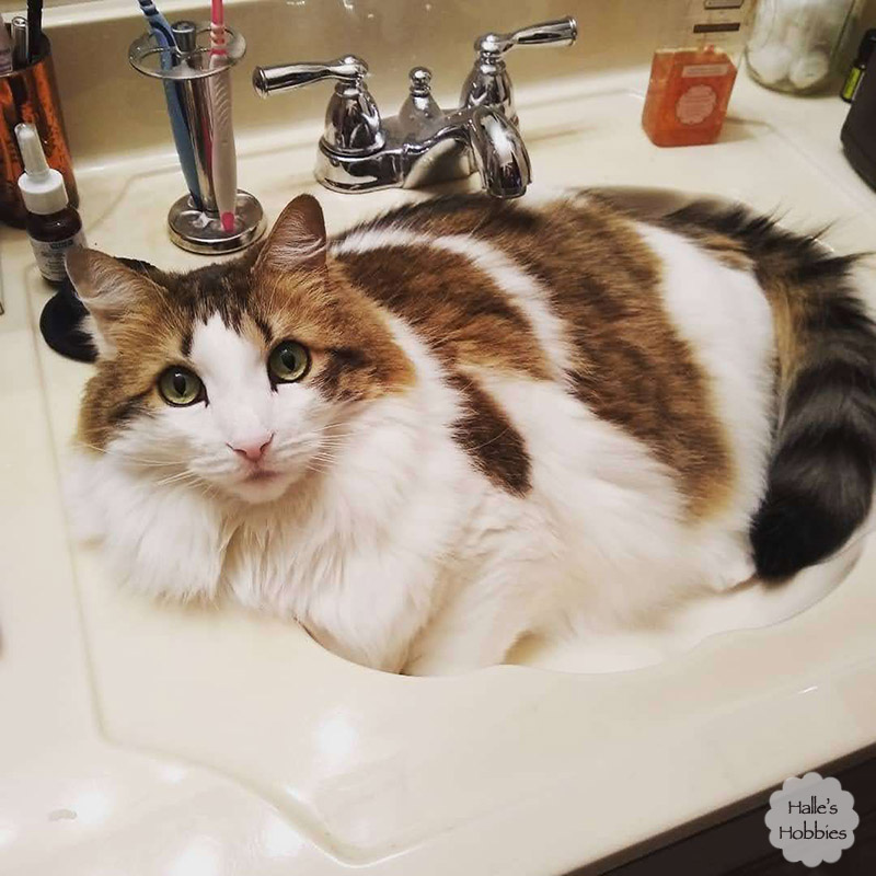
I had some “help” taking my photos this morning…
~~~~~~~~~~~~~~~~~~~~~~~~~~~~~~~~~~~~~~~~~~~~~~~~
Sorry for the wonky formatting…I was trying something new with my blog at the time. I honestly could have fixed it before reposting today but what the heck…that’s the way it actually was in 2013.