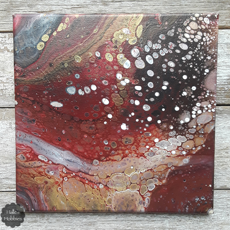
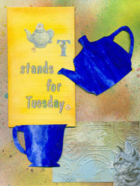
The calendar says its Spring but I think Mother Nature needs her head examined. It’s cold and snowy. So since the weather isn’t cooperating I figured I’d create something that would brighten the gloomy day.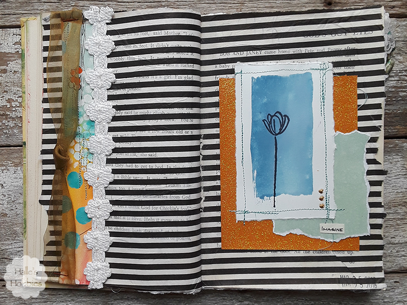
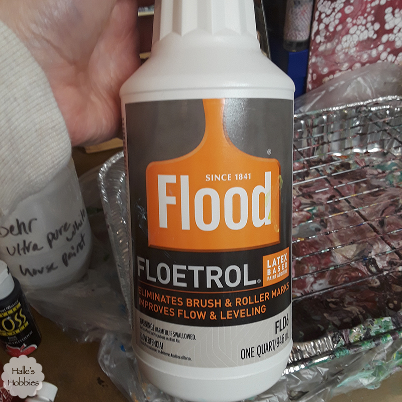
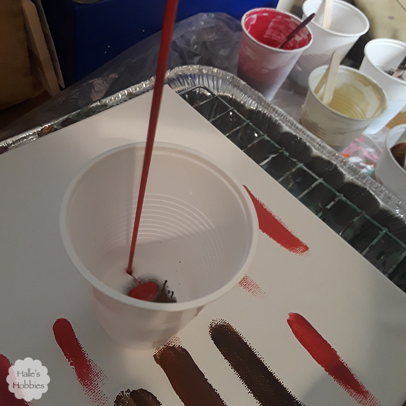
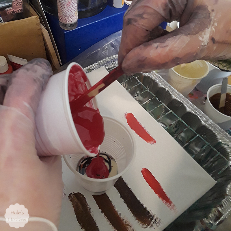
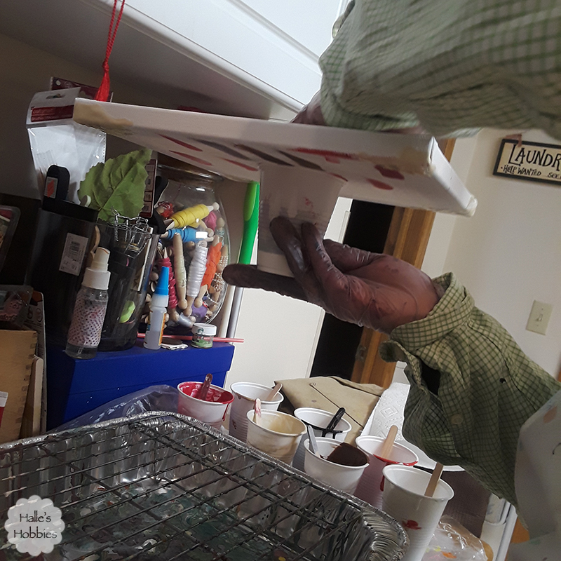
I pulled bits together from my scrap bucket.
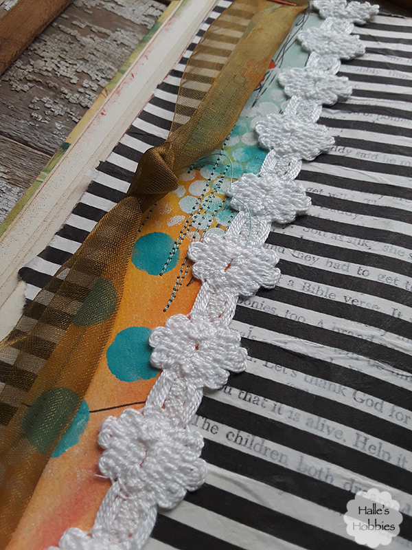
I even briefly set up my sewing machine on my workspace to get some stitching onto the page. I sewed this scrap directly into the book.
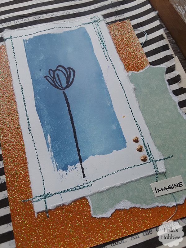
This piece was stitched together before gluing into place. Gosh I’ve missed using my machine! For some reason it inspires me.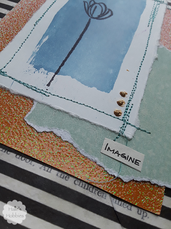
Lastly I added the word imagine. I was trying to imagine what Spring should feel like. I’m linking up with AJJ for Spring.
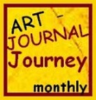
With it being spring break so many people are traveling. Mini-me and I did as well. It wasn’t a tropical destination. It was 4 hours NORTH of here for the state archery tournament. 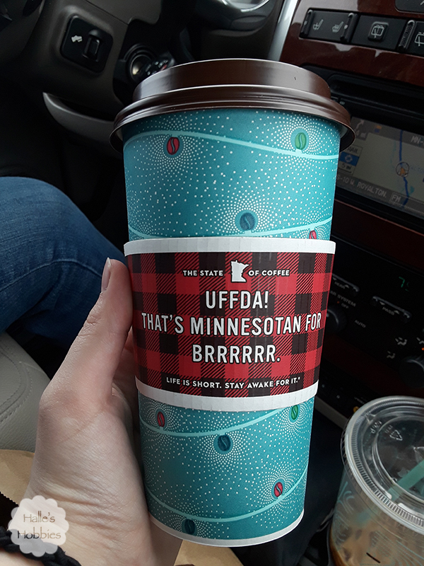
We drove up on Friday and spent the night in a hotel since she didn’t shoot until Saturday. A snow storm was expected anyway so might as well go early. Thankfully we never did get any snow…just a cold wind.
We had to do the usual tourist things…amazingly enough there was others venturing into the frigid wind off the lake for a photo op that were nice enough to take a picture of us. That may look like standing water under Babe the Blue Ox but its solid ice.
After the tournament (at which she beat her personal best score by 24 points!) we headed for home but took a slight detour since we were that far north to visit Itasca State Park. 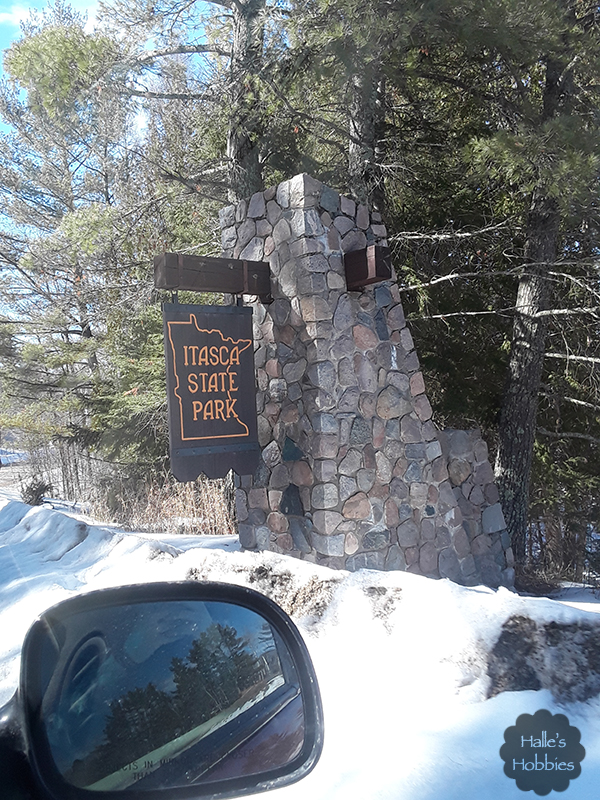
As we turned in we quickly realized that we probably wouldn’t get to see the headwaters of the Mississippi as we had wanted. Some of the roads weren’t even plowed. Instead we just took a photo of the map on went on our merry way.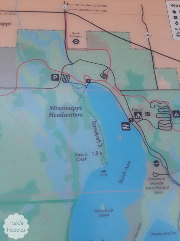
I really wanted her to be able to jump across the Mississippi as I had when I was a kid…heck, I wanted to do it again now! Oh well…maybe another trip.
This is typically when I share my photo challenge but I’m woefully behind. I will get caught up though and share them next week as well as the next months challenge.