Since I knew I had a three day weekend I decided to eek out a bit of time to try out acrylic pours again.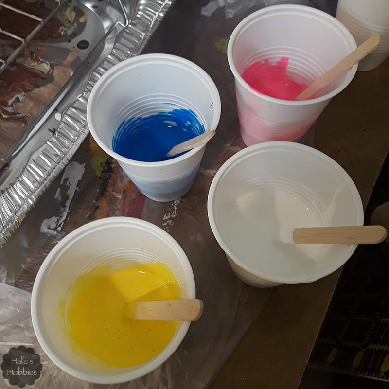
I have seen amazing results using the three primary colors. I decided to go in a slightly different direction…just slightly. I used colors you’d typically find in your ink jet printer….plus white instead of black.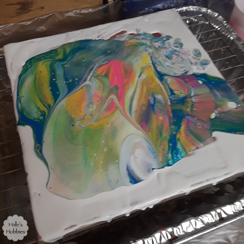
Sorry this one is blurry…I had paint on my gloves and couldn’t focus it. After flipping the cup onto the canvas I poured the excess white around the outside of the “unicorn poop” paint puddle. Amazing how many colors I already have.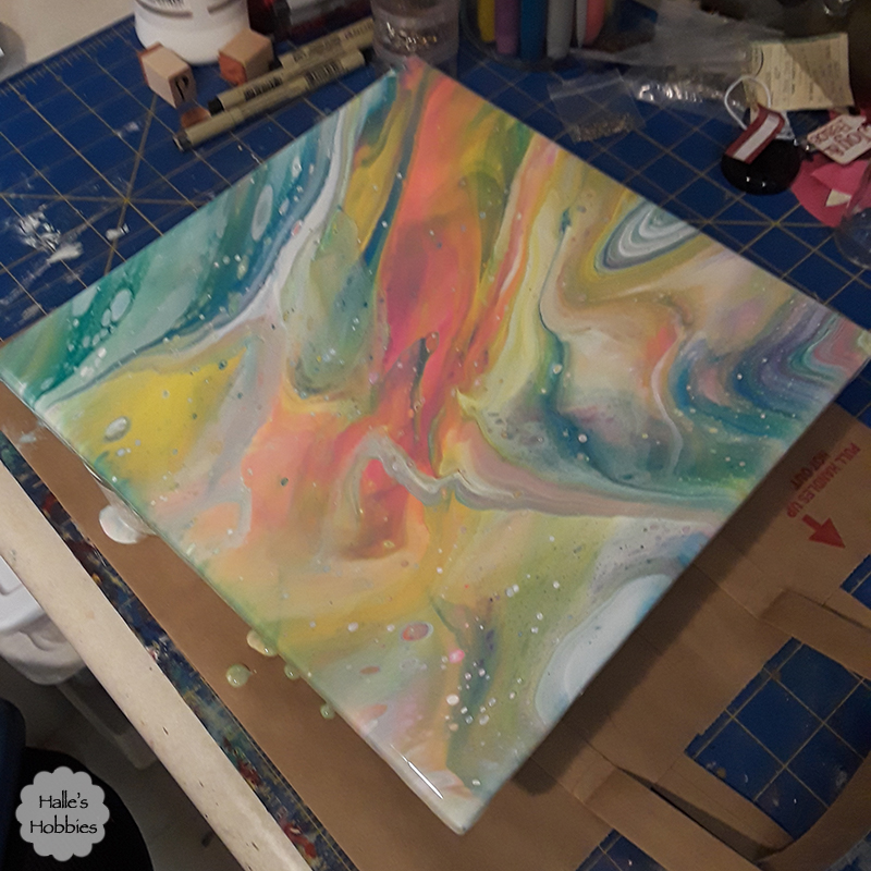
After tilting and draining off excess paint I set it aside to dry, coming back occasionally to wipe the drips from the underside of the canvas.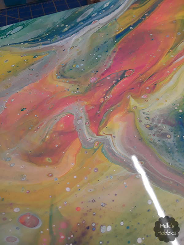
I love the little bubbles that come up through the layers and pop revealing other color.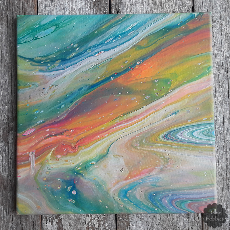
Here’s the completely dry canvas. The colors are much less vibrant in matte form. Perhaps I’ll put a coat of gloss varnish over top to brighten things up.
I’ve got another basically dry and yet another freshly poured canvas. I’ll share those in another post.