• Art - Blog - Creativity

    Junky art journal

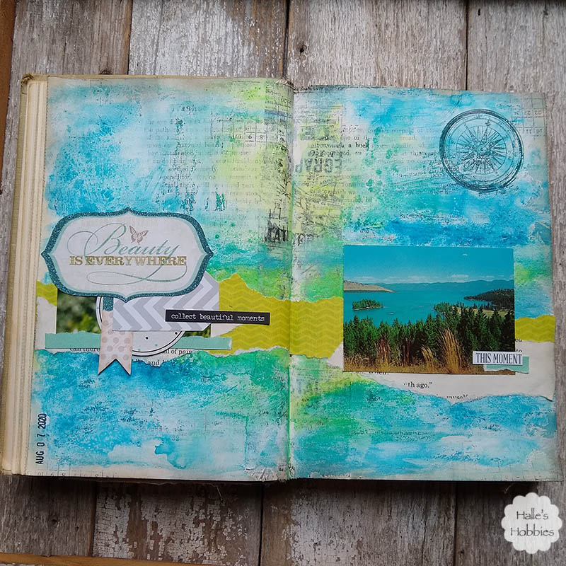
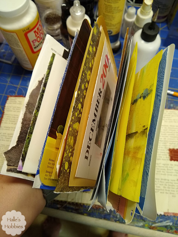
    As so often happens, I was inspired to create smack in the process of cleaning up my art space. I had bits of this and that laying around…parts of projects that went astray…papers headed for the recycling bin…you know the usual junk that seems to take up my precious space.

    The inspiration to make a small hand bound art journal was from Susanne Rose art. I follow her in Instagram and always love seeing her work in these small journals

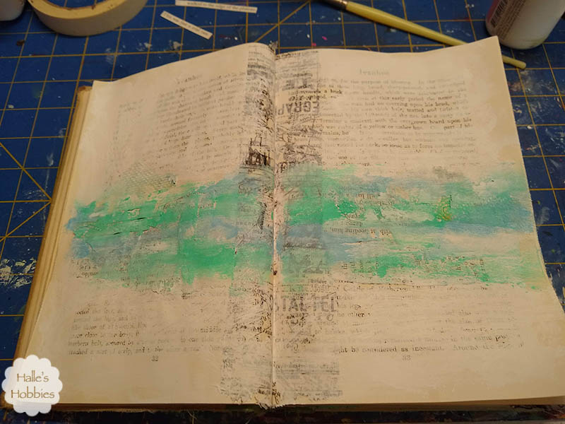
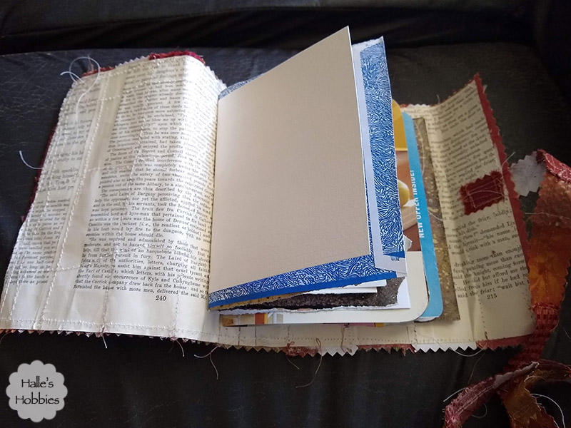
    All of the pieces I had laying around really worked well in a small size.


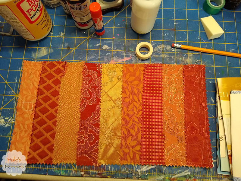
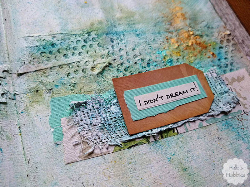
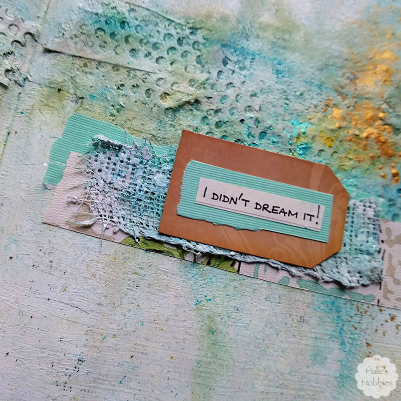
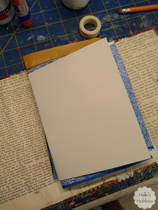
    Including these upholstery fabric strips… again cut for another project that never came together. They worked perfectly stitched down on a stack of book page and plain newsprint paper.


    I stitched my signatures in using waxed linen and a pamphlet stitch.

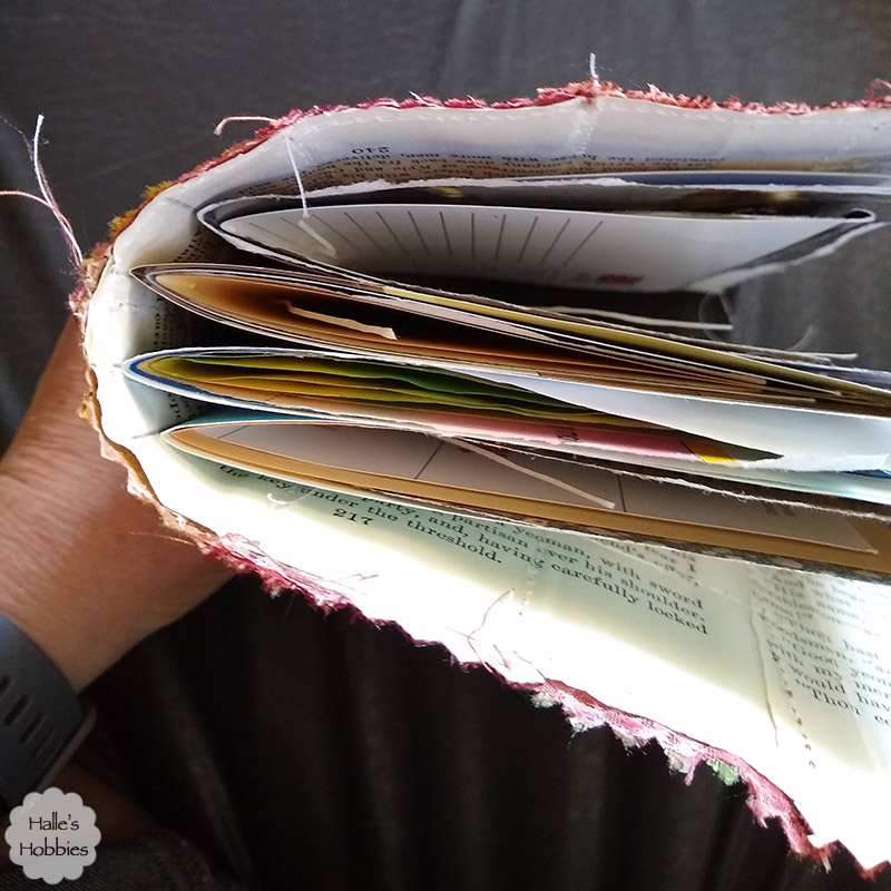
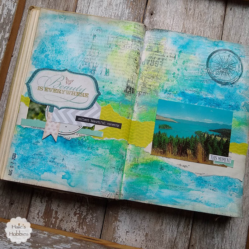
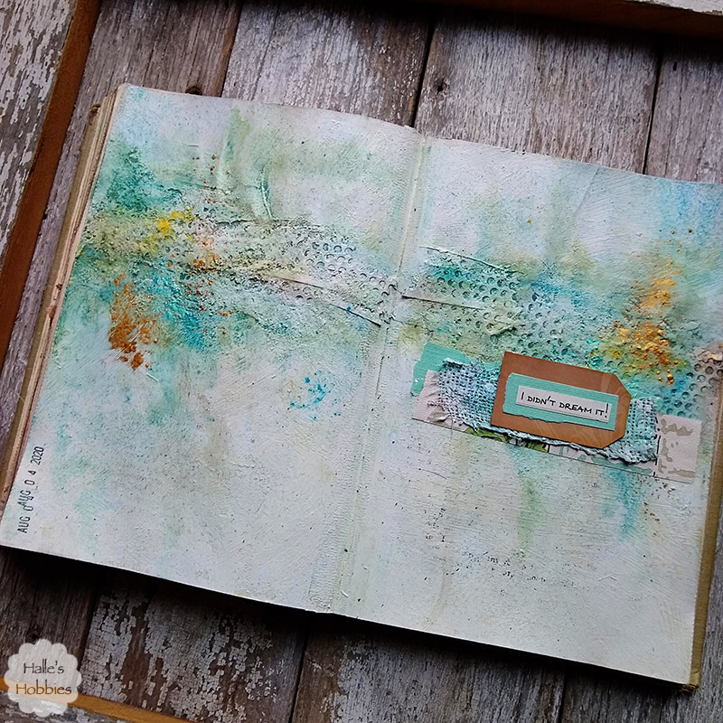
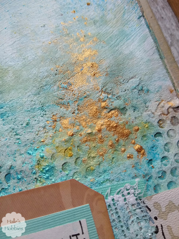
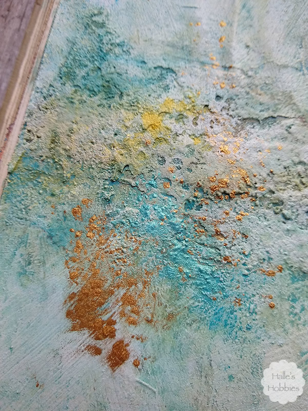
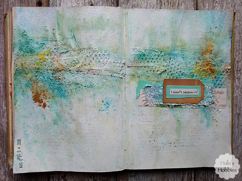
    I was sure to leave lots of space this time around. I tend to make very chunky pages… especially when I don’t have the space.

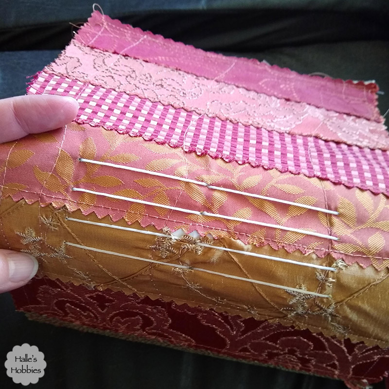
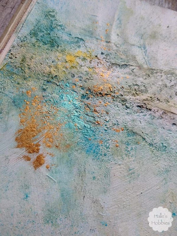
    I goofed a little here. The needle didn’t pierce the gold fabric on the first stab through. I may use some lace to cover or just leave it as is.

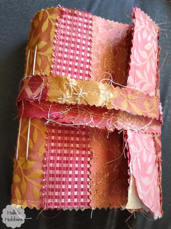
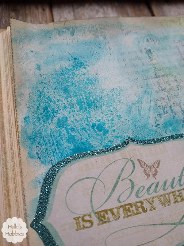
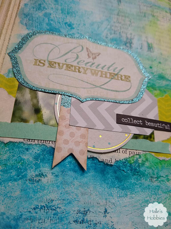
    It’s not meant to be perfect. It’s wonky. It’s junky. It’s fraying. It’s just perfect for experimenting.

  • Blog

    Beautiful moments

    I was inspired to create this journal page while reminiscing about our trip west last summer. So many beautiful sites. So many memories made.

    The page started out quite simply.

    I used Tim Holtz tissue to reinforce the spine of my Ivanhoe journal. I knew I wanted the focal point to span across the two page spread. I added lots of texture to begin with since I thought I was going to be using a lot of spray inks again. I went in another direction and used watercolor color crayons instead.

    While the watercolor was still wet I sprinkled some baking soda in various places. It gave some nice subtle texture as it puled the color into the soda.

    I also added lots of texture with the different choices in papers. From the vintage souvenir photo to textured card stock…

    I layered tags, photo off-cuts, scrapbook paper, book page and stickers with wild abandon.

    In the end I had a journal page that echoed my thoughts of our trip.

    Linking up with Art Journal Journey for Pockets and Tags hosted by Alison.

    Art Journal Journey
  • Art - Blog - Creativity

    I didn’t dream it

    I’ve started working in a new journal.  So far this one is focused on texture. Not a conscious choice but I see the pattern developing.

    The sky was the limit on what I used on this page, which may seem odd since there isn’t that much color going on.

    I started out by taping down the center of the binding with masking tape. I added some ripped pieces along an imaginary horizon line to start my texture process. Next I added ripped pieces of drywall tape. The texture wasn’t feeling right to me so I grabbed some light texture paste. I’m not sure what has happened to the jar but it was weird…I used it anyway but it got my pages really wet.

    After drying them with a heat gun, I grabbed a jar of white house paint I’d been using for paint pouring a couple years ago. It has really thickened over time in the old peanut butter jar. Perfect!

    I walked away for a while as I often do. Do you complete a page in one sitting? Doesn’t happen much for me…always seem to be waiting for something to dry. When I came back some of the white paint was STILL wet…I decided to sprinkle some baking soda over the wet areas. I rubbed some of it in…other areas I continued to let dry.

    I knew that I wanted to make all the texture pop so I used sage green distress paint and sprayed water to make it flow. While it was still wet I dripped some brown and gold glimmer mists as well. I used a paper towel to mop up excess moisture in places. Used the heat gun to partially dry…and start the process all over again.

    It wasn’t quite blue enough for me so I used a watercolor crayon to make the blues pop since I had already picked out the teal textured card stock and tiny piece of vintage wallpaper.

    Since I’ll never be accused of less is more…I grabbed some pigment powders and knocked some powder off a fluffy brush onto the wet page. Now I was really loving where this was headed.  I took it outside and sprayed satin  clear coat to set the powders.

    I used the same products to color a small piece of plaster casting to add yet another layer. The tag is punched from Tim Holtz packaging. It was too pretty to toss.

    I didn’t lie when I said I used a little bit of everything on this page!

    Linking up with Art Journal Journey for Alison’s theme of Pockets and Tags.

    Art Journal Journey