• Art - Blog

    SOC: Charcoal Grey & Pale Pink

    20130702_2348 20130702_2350 20130702_2349
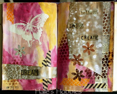
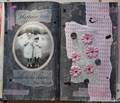
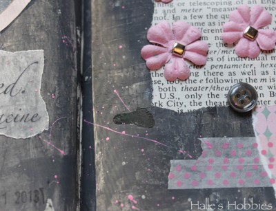
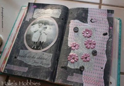
So here we are at week 4 of The Summer of Color with Charcoal Grey & Pale Pink. A much easier set of colors for me.

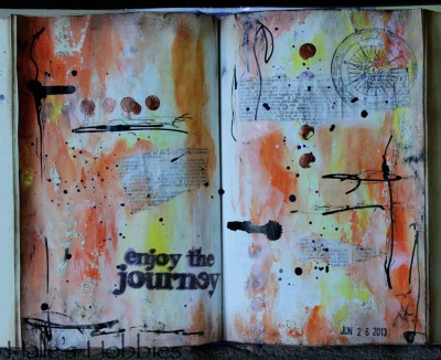
    I had a bit of a hard time getting the right grey until I read on Elizabeth’s post that she puts a little purple into her grey’s to give it more intense color. It worked!! So happy….thanks E!

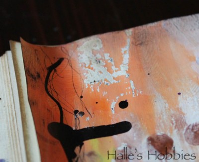
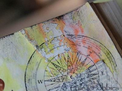
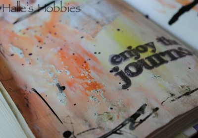
    I’ve been doing a lot with splattering paint and inks lately. It seems  to add the texture I’m seeking.

    I have to admit that this shot with those colors makes me think 1980’s…”like totally“. There are parts of the 1980’s worth reliving…

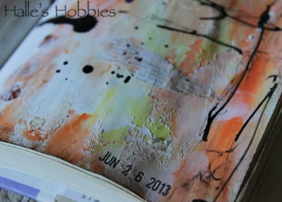
    I’m also loving the texture I pressed into the grey. I was actually trying to stamp some black texture into it but the paint was still too wet. I decided to run with it.

    I had some “help” taking my photos this morning…

  • Art - Blog

    Enjoy the journey

    For so long I struggled, and likely will again, with art journaling. Lately, it’s all I want to do. I’ve even started another book, one from the public library’s free shelf. It’s a teen fiction book called Kira-Kira.

    kira-kira (kee ra kee ra): glittering; shining

    I loved that! Also since it’s a slightly smaller book, I thought it would be perfect for another art journal.

    enjoy the journey

    I turned to the middle of the book and started painting with my fingers. No thought…just went for it. I definitely thought I’d wrecked these pages several times over.

    enjoy the journey2

    First when I accidentally flopped the wet pages together, causing them to stick and tear away the top layer.

    enjoy the journey4

    But in fact, it created some really fun texture and effect that I could have never created on my own.

    enjoy the journey5

    Yummy, grungy texture…makes me so happy!!

    enjoy the journey3

    The second and third time I thought I’d ruined the page was when I stamped the words with dye based in and it quickly faded and soaked into the painted page.  I went back with pigment ink and it was a really crappy image. I once again re-inked with pigment, carefully alining the stamp and finally got an image I could be happy about.  As it turns out, the dye based ink looks a bit like a shadow that I meant to have…happy accident.

    I wish I didn’t have so many things on my plate today…I’d love to play with paint and paper all day!  What are you doing today?