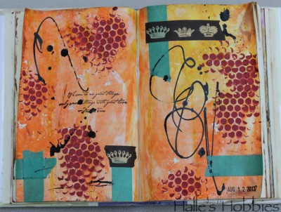
 I’m back at the drips, splatters and squiggles. I couldn’t help myself.
The partially obscured quote is:
We can do no great things, only small things with great love. ~Mother Teresa
I’m back at the drips, splatters and squiggles. I couldn’t help myself.
The partially obscured quote is:
We can do no great things, only small things with great love. ~Mother Teresa
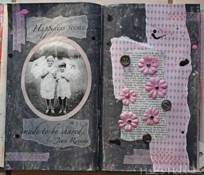
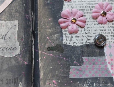
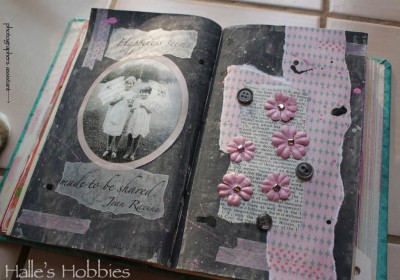 So here we are at week 4 of The Summer of Color with Charcoal Grey & Pale Pink. A much easier set of colors for me.
I had a bit of a hard time getting the right grey until I read on Elizabeth’s post that she puts a little purple into her grey’s to give it more intense color. It worked!! So happy….thanks E!
I’ve been doing a lot with splattering paint and inks lately. It seems to add the texture I’m seeking.
I have to admit that this shot with those colors makes me think 1980’s…”like totally“. There are parts of the 1980’s worth reliving…
I’m also loving the texture I pressed into the grey. I was actually trying to stamp some black texture into it but the paint was still too wet. I decided to run with it.
I had some “help” taking my photos this morning…
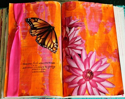
So glad orange and hot pink were chosen for the Summer of Color week 2.
I love this color combo! It’s got 3 B’s going for it…bold, bright and beautiful!!
© 2007-2026 Halle's Hobbies All Rights Reserved -- Copyright notice by Blog Copyright