Tag : SOC3

6 posts

Sage and Sepia
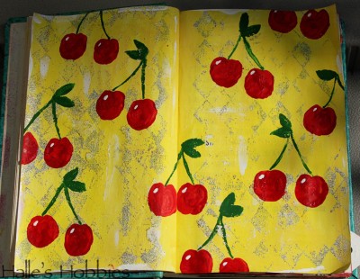
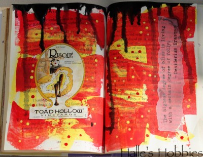
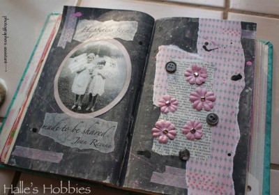
This is the last week of Summer of Color! I can hardly believe it.

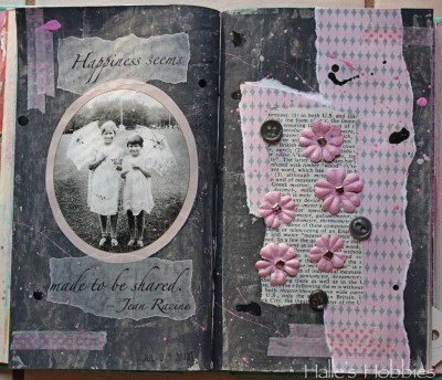
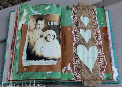
This is the color combo I’ve been voting for each week. The strange thing is now that I got it…I had trouble making it work. The photo color is a bit off for the green but my “Photoshop fu” is off this morning.

I painted the background with sage then distressed it a bit.  After adding the sepia elements, I used some white rub-ons for visual interest. The bride and groom are my maternal grandparents circa 1929.

Incidentally, this is my 1000th post! WHOA! That’s a lot of blogging. Thanks to everyone who continues to read. I love it when you leave comments to let me know that you’ve been here.

cherries red and yellow red and yellow quote

Time is flying!! It’s week 5 of Summer of Color already!

These colors always make me think of feed-sack cloth, vintage aprons and kitschy kitchens.

So what else could I do but an ode to a simpler time.

Not wanted to waste the extra paint I scraped it on another book page. After finishing the cherries page I love the look of the pages so much I decided to dress it up a bit .

It’s a two for one this week.

20130702_2348 20130702_2350 20130702_2349So here we are at week 4 of The Summer of Color with Charcoal Grey & Pale Pink. A much easier set of colors for me.

I had a bit of a hard time getting the right grey until I read on Elizabeth’s post that she puts a little purple into her grey’s to give it more intense color. It worked!! So happy….thanks E!

I’ve been doing a lot with splattering paint and inks lately. It seems  to add the texture I’m seeking.

I have to admit that this shot with those colors makes me think 1980’s…”like totally“. There are parts of the 1980’s worth reliving…

I’m also loving the texture I pressed into the grey. I was actually trying to stamp some black texture into it but the paint was still too wet. I decided to run with it.

I had some “help” taking my photos this morning…

lime green and purple

These colors were definitely NOT my vote for the 3rd week of The Summer of Color challenge.

I started by spreading gesso on my cursed journal pages, let it dry, dragged purple craft paint over the top with an old credit card then immediately hated it.


lime green and purple detail

Trying to salvage things I went with a technique I’ve previously only used on much sturdier substrate. I sprinkled baking soda over the wet purple paint. After it air-dried completely, I brushed away the excess baking soda to reveal a textured background that was much more appealing. The soda crystals even sparkle in the right light.

I had some previously painted watercolor paper with this weeks colors in my scrap bucket that I figured I’d make work.  After pulling together more pieces of lime green and purple the whole thing came together into something that’s not so bad after all.

orange and hot pink

 So glad orange and hot pink were chosen for the Summer of Color week 2.

I love this color combo! It’s got 3 B’s going for it…bold, bright and beautiful!!


20130612_2258I’ve decided to join a summer challenge put forth by Kristen of Twinkle, Twinkle. This is her 3rd Summer of Color challenge.

The first weeks color combo is citron green and turquoise.

Fun!!

20130612_2257I was brave and grabbed my cursed journal once again since I have been known to create something very pleasing to my eye in it at least once before. ;)

I have to admit that I love this color combo!!

The pages are very simple but yet make a statement with the color and texture.

20130612_2259The bright, make you feel alive, colors are adding some much needed energy to our gloomy weather around here.

Make sure and stop by Kristen’s blog to see what the other participants have come up with this week!


PAGE TOP

© 2007-2024 Halle's Hobbies All Rights Reserved -- Copyright notice by Blog Copyright