The words appeared for this page and I fell in love. The streaks of grey give the illusion of objects falling. The heart was already on the page. Love it when things work out like that!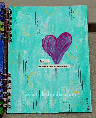
I’m also loving the font of the book I’ve been using to find text. It’s a children’s or maybe a tween novel called Ghost in the Machine Ryan’s Journal.
Feels good to be creating again.
Found text is something I should look for more often, because you certainly have used it to your advantage. I agree that the grey gives the illusion of falling objects. Beautiful interpretation and great use of the strong colors, too.
Great page that suits your subject perfectly. I really love your sense of colour and your designs are always just right whether simple or intricate. That found text is great – I like the font. Thanks for droppin in on my mind map too! 🙂