Since I’m guest hosting over at Art Journal Journey this month I thought I’d make this a twofer post.
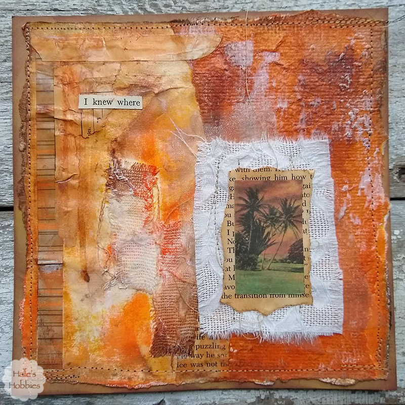
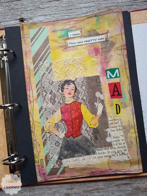
The journal page I created for my theme of Words to live by completely fits the bill.
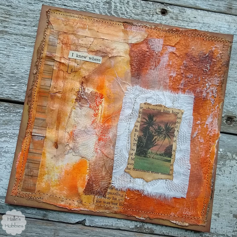
I wish I could remember exactly who gave me the stamped handmade paper piece but I’m not sure.
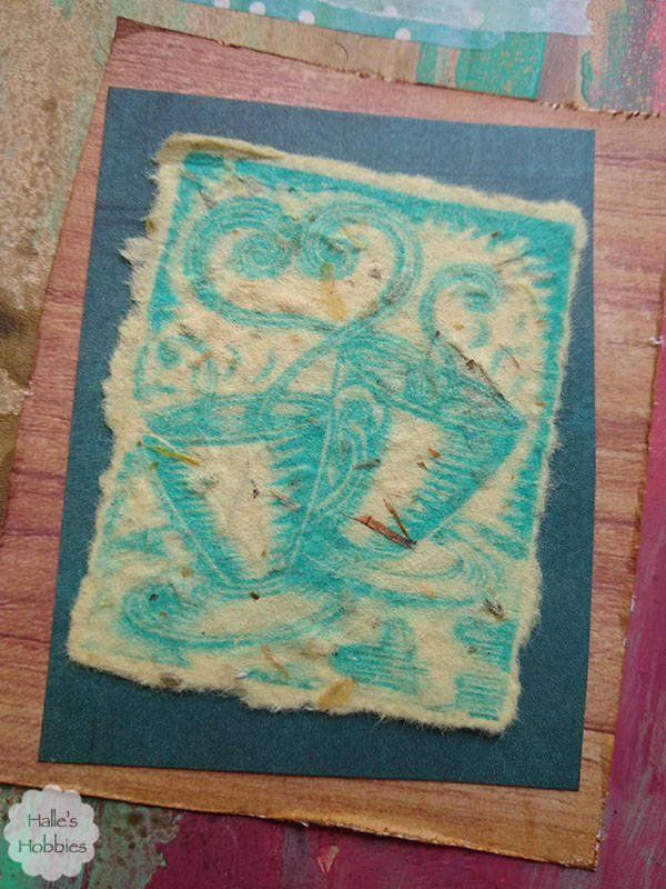
I have an idea but maybe if she recognizes it she can speak up and I’ll know for sure.
I have quite a bit of coffee themed items that were collected and traded for long ago to create an altered book. With that book complete, I now have lots of fun items to use in other creative ways.
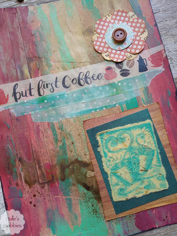
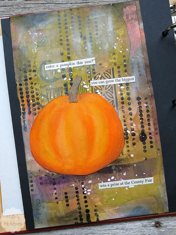
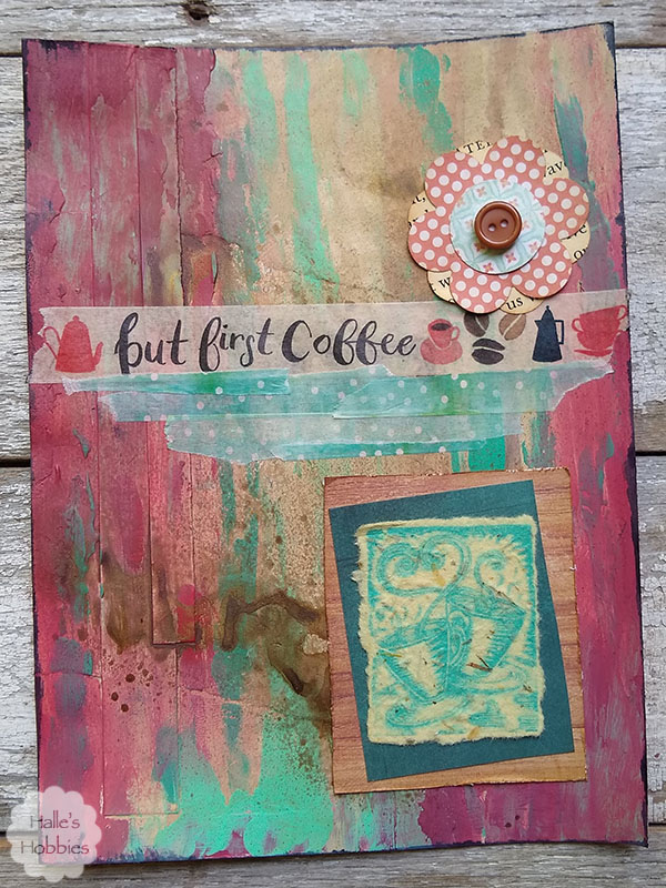
The background for the page was layered with random papers from my scrap bucket. Over the top I spread red, turquoise and cream with my fingers in a loose fashion…almost giving the appearance of peeling paint. The colors were a bit to bright so I first used some distress paint then glimmer mist to tone it down. Now I was at the color I was searching for.
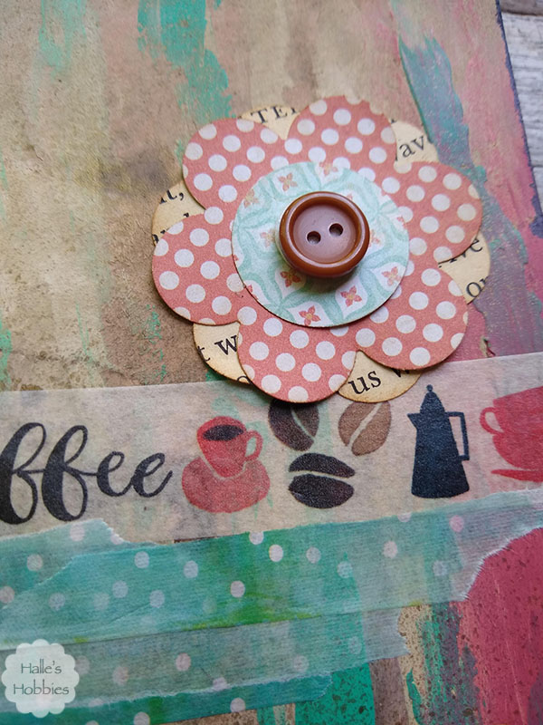
I added washi tape with my sentiment boldly across the page then softened it with some torn washi in a complementary color. I then added a stacked button flower embellishment from my stash for a bit more interest.
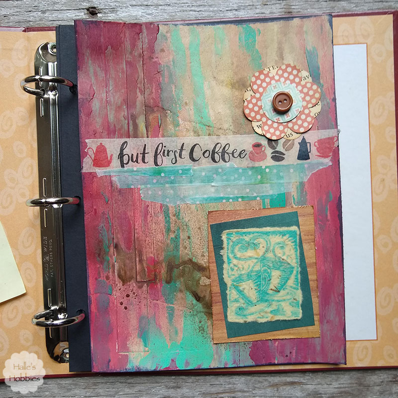
This is another loose leaf journal page sized for a new art journal I’m working on. I love working in loose leaf. Being able to add stitching, eyelets or brads simply anywhere frees my creative process. Of course this page is not an example of that.
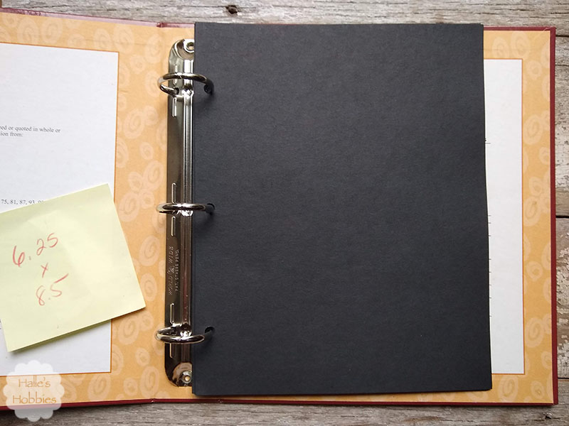
My new journal is an old recipe binder. I cut pages to fit out of black card stock and will adhere each completed journal page to the card stock.
The binder is yet undecorated as I’m not sure what I want to do with it. I was thinking about giving it some gorgeous texture but now I’m leaning more towards a fabric slipcover. Indecision at its best.
I’m not even worried that the journal pages I create are an exact fit for the pages.
This page from my previous post will leave a bit of black page showing on both sides. I almost prefer this look to the fit of my coffee page.
This week has a college visit tied into a mini-vacation for Mini-me and I. We are both super excited for a little time at the lake. Hopefully the weather cooperates with us!
What are you doing today?