• Art - Blog - Creativity

    Words of wisdom to a child

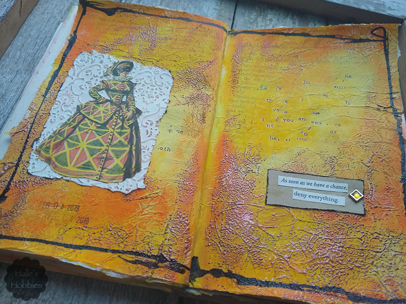
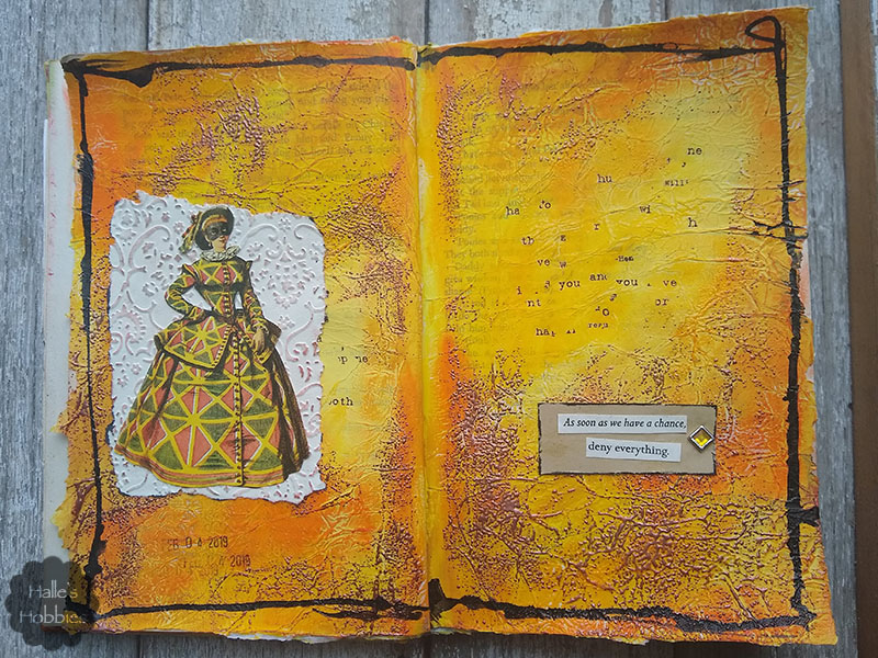
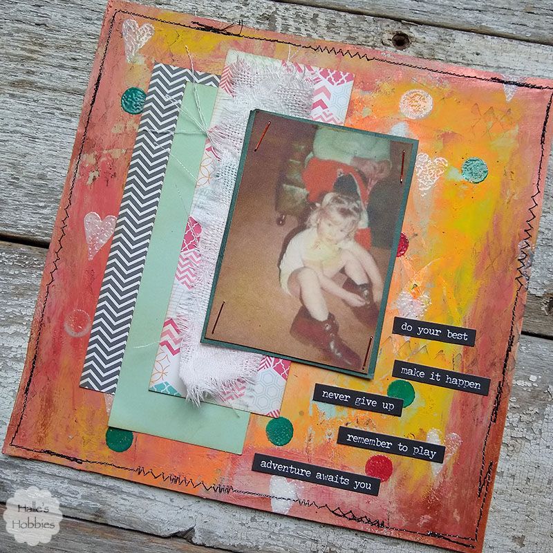
    Last week I found this image I’d printed ages ago…I knew immediately that it would become a focal point in an upcoming journal page.

    Since I’ve been using the term “mop up paper” quite often lately I thought I’d share a bit of a process post to give visuals to my words.

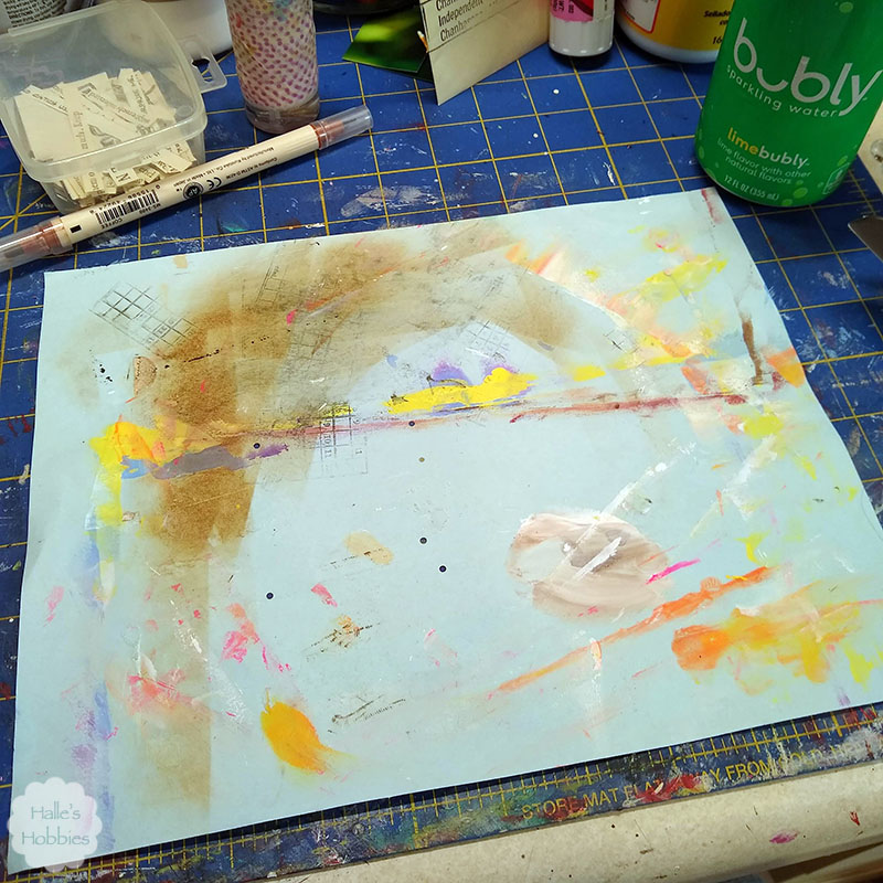
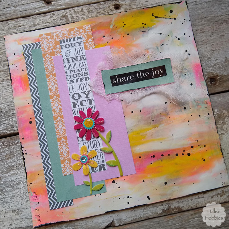
    This is where my page started. A sheet of blue copy paper 8.5 x 11 inches. I used a glue stick to adhere it to some lightweight card stock.

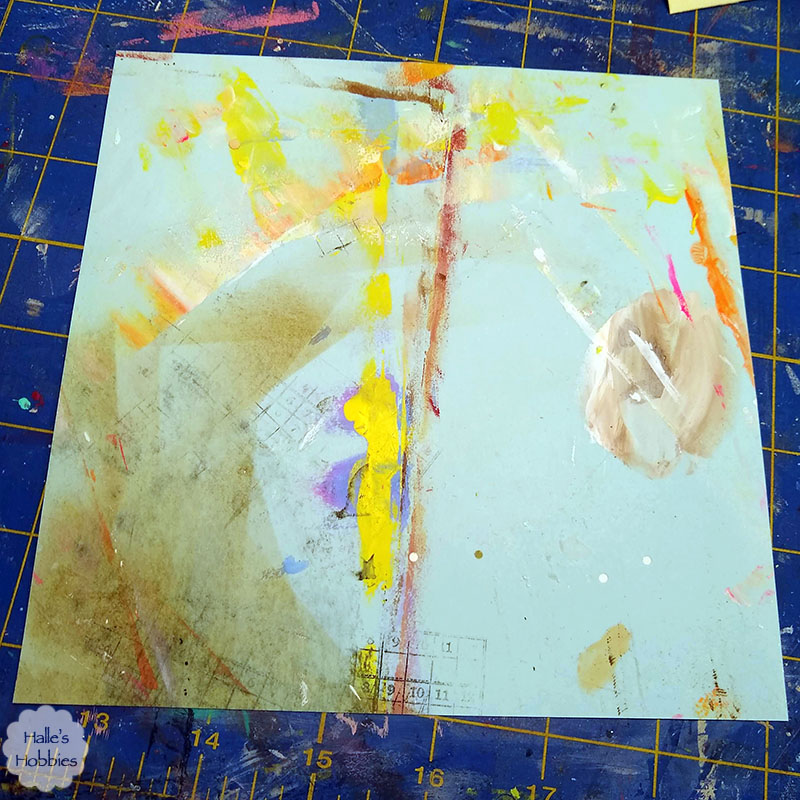
    After the glue was dry I cut it down to my desired size of 7 x 7 inches. Next I got out craft paints and used my favorite tool…my fingers…to spread several colors of paint over the page.

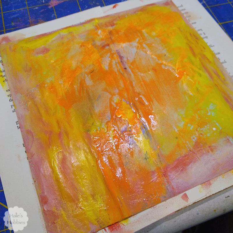
    Some of the colors are more transparent than others allowing the original color and marks to show through.

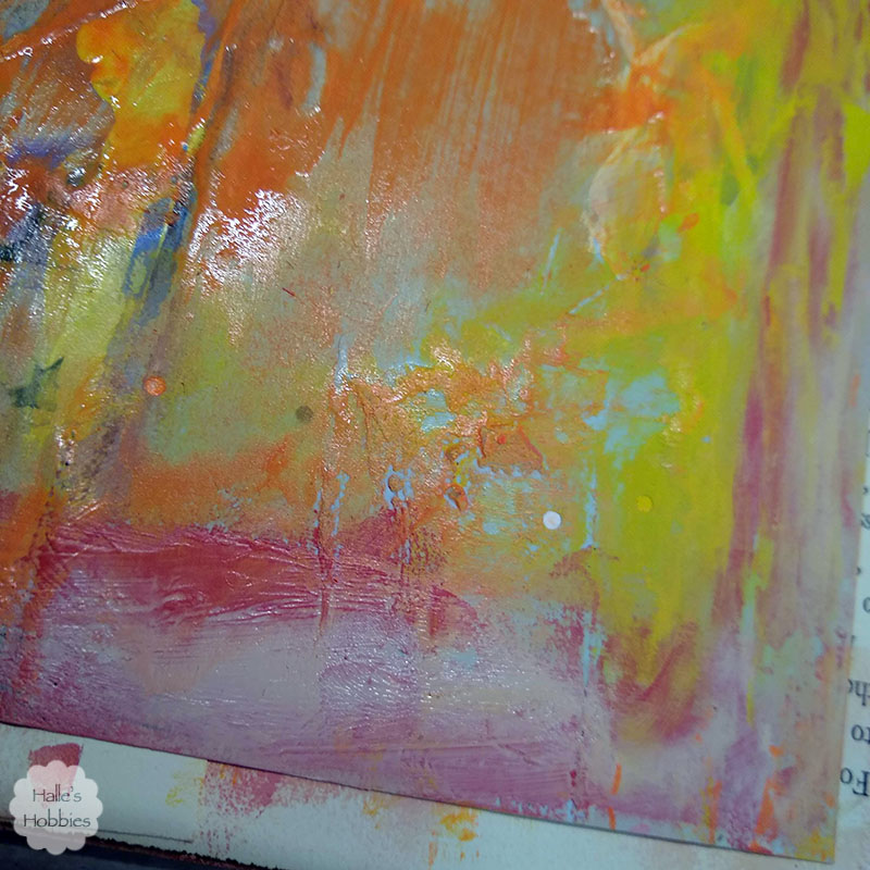
    Look at that yummy texture…  I decided to let this air dry overnight instead of drying it with the heat gun.

    Of course this is where my process failed…I totally forgot about the fact that I was taking photos step by step.

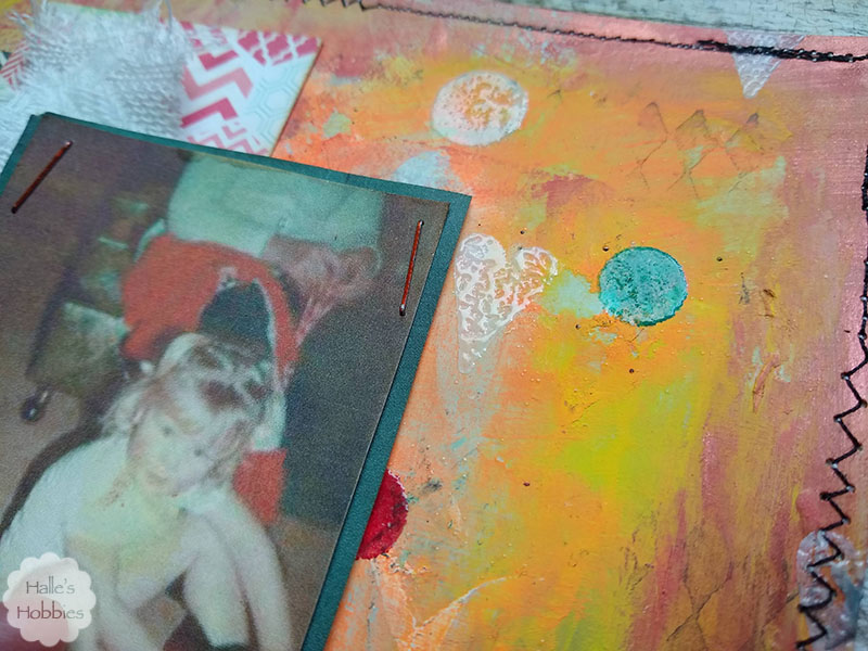
    I used rubber stamps to create some background texture. The black ink harlequin was super subtle…I felt I needed a bit more color and shape. Since most of my stamp pads are pigment ink I used clear embossed powder to set the ink.

    I also took the completed background to my sewing machine to stitch a funky border in black to contain everything.

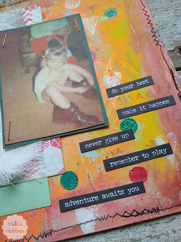
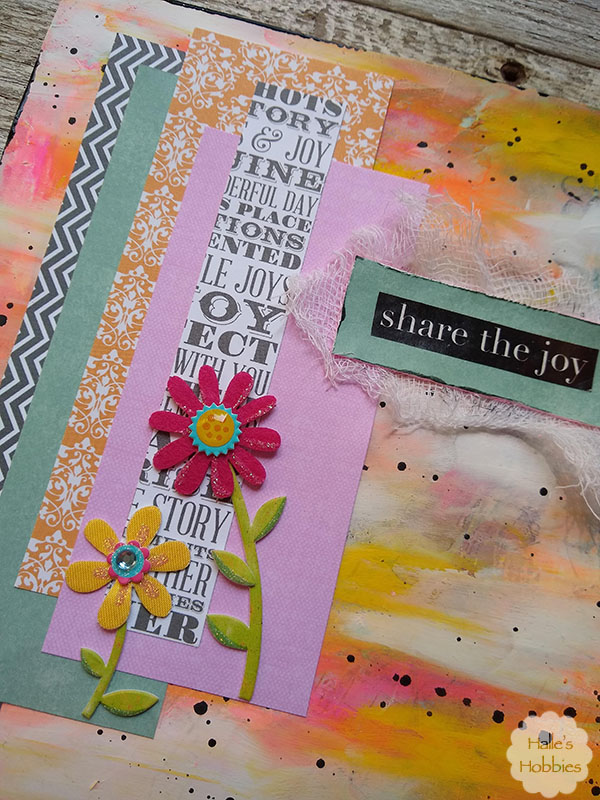
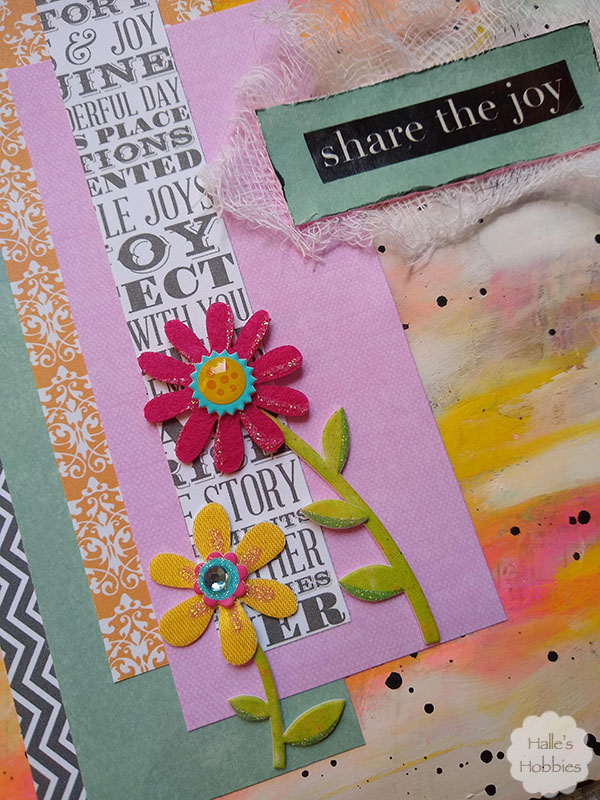
    Next I created some layers with paper and fabric to give an anchor to my image.

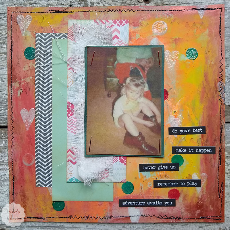
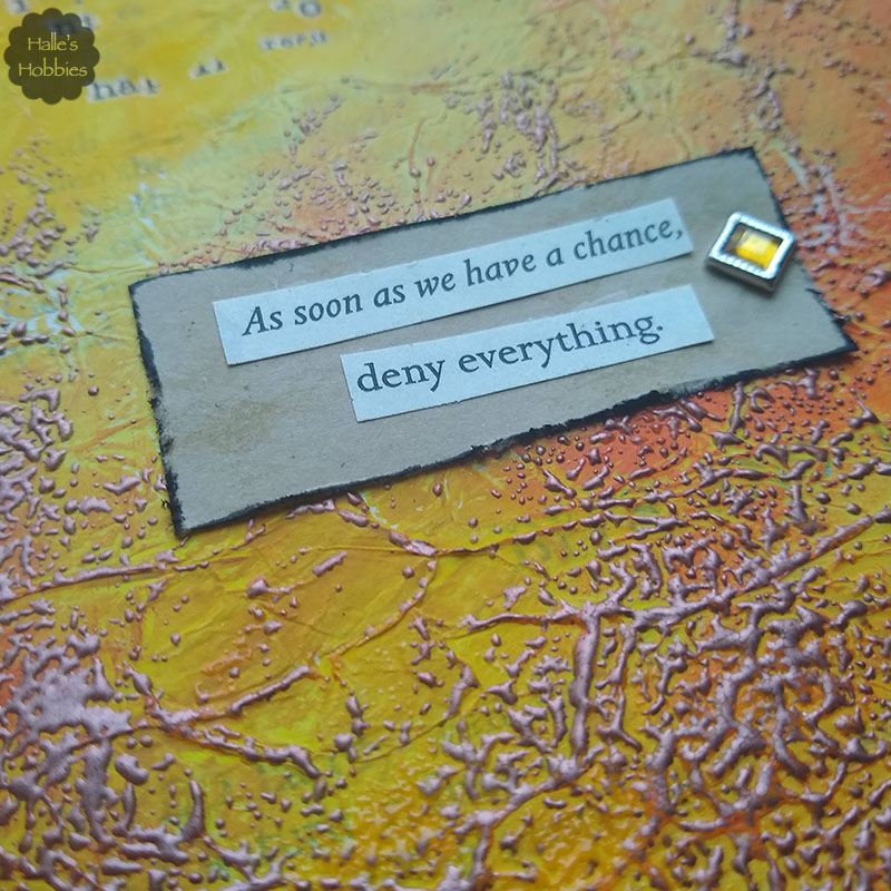
    Last but not least was the words of wisdom to a little girl learning to tie shoes with her daddy’s shoes. I love that they are on the wrong feet too.

    Not only am I linking up with Words to live by on Art Journal Journey guest hosted by yours truly….

    Art Journal Journey

    but I am also linking up with Try it on Tuesday for Make a Mark.


  • Art - Blog - Creativity

    Share the joy

    Welcome back to Halle’s Hobbies. Glad you could stop by today to check out another page for Words to live by on Art Journal Journey which I happen to be guest hosting this month. Yay!

    I had really thought I posted this earlier but I had only uploaded the photos. I guess that’s what happens to our brains during the last week of school. Mush…mush for brains. Anywho…

    I started with a page of thin blue/green mop up paper. Since it was too thin I adhered it to another sheet of thicker paper. Next I began using my favorite tool…my fingers…to paint over the chaos with bright happy colors…yellow, pink and orange. It was a little crazy so I muted things down with some white paint. After setting it aside to dry a while I cut it down to my 7×7 scrapbook journal size.

    I pulled out some scraps that complemented my color scheme at this point. I began to play with layers until I found something that pleased me. Before gluing them down I decided some spatters of black were needed to help form a cohesive look.

    Next I added some cheery flower stickers that just happened to match my color palette. The last thing was the words. I searched through my stash of words and phrases and quickly found the perfect one. 

    Share the joy.

    It wasn’t until I was taking these pictures did I notice that the scrap with the words had JOY visible twice.

    I’d love it if you’d join me for Words to live by at Art Journal Journey this month.

    Art Journal Journey
  • Art - Blog - Creativity

    Texture rich journal page

    Recently the cold weather had me reaching out for warmth anywhere I could think of…it really showed through in the warm colors of this journal page.

    Can’t you feel the warmth radiating off the page?? Come on now…use your imagination..ah isn’t that better. Toasty warm.

    The image I chose made me think not of a masquerade ball as intended but to something sneaky…not dark and sinister but sly and cunning. I had to find the right words to match my thoughts.

    Don’t you just love it when things work out like that!

    Did you check out the texture!?! My first layer on this page was tissue paper. Over top I blended several shades of yellow and orange with my fingers until the overall look pleased the senses. Seeking more texture I attempted to stamp with some nearly ancient pigment ink pads…alas they left very little mark. Then I had the idea to smudge them here and there then sprinkle clear embossing powder over top. I had hoped I’d get more color from the ink…it was not to be.  Then I decided to get even more aggressive with the ink pads and use some UTEE in copper. I really love the end result.

    I also added some bits of leftover rub-on quotes I had laying around. I think it adds to the mystery of the page and what the masked woman is planning to deny.


    My last step was to add a bit of India ink loosely around the edges to act as a frame.

    Linking up today with Art Journal Journey for Yellow.

    Art Journal Journey