Yikes…Kristen picked a little harder set of colors for me this 3rd week of The Summer of Color! On first inspection I thought….”sure, you got this”…but as it turned out…it was harder that I thought to come up with something.
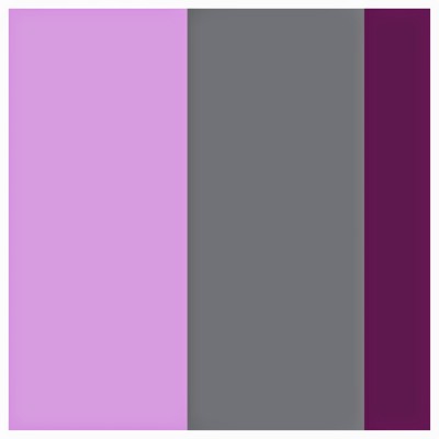 Lavender & Grey with a Smudge, Splash or Pop of Plum
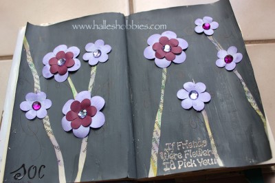 It’s not my favorite journal page. My grey paint was way thicker than I wanted so the page looks too “flat” to me. Oh well…live and learn.
I focused on the elegance of the combo as my inspiration. I thought about adding sparkles to my grey because I also found it a bit flat. Rinda
It was hard for me too, but I found a way out of it. Your spread is good, but I see what you mean by flat. Perhaps if you dabbed on some lighter grey to the background, it would turn more “alive”.
I like your spread and think the dark background makes the flower pop out more. Just my 2 cents.
It’s a very nice layout and you’ve kept well to the colours. I like the way you have made the stems with text.
Challenges are good for helping us stretch our creative muscles…
those colors are interesting.
I really like the text stems on your pretty flowers Halle.
oxo
The colours are used well here, this is a lovely piece! The flowers stick out nice and bright against that dark grey, good job!
I love the stems too!! Very stylish!
Visiting from SoC – I love your flowers so much. I have yet to come up with something 😀
I think you’ve combatted the flatness of the grey with the 3D flowers, which pop nicely off the page. Grey can be such a difficult colour 🙂
xo 😉
Love the journal page the colors really pop on the grey background!!! I haven’t started mine was thinking of doing more flowers this week I liked my flowers last week 😉
you did a marvelous job with the colors-these are not my fave and were a challenge for me too:)
You may have found these colors hard, but I thought your completed spread was lovely. I especially like the stems made from book pages and the bits of bling you added. Of course, the sentiment had me grinning in agreement, too!
awww I think this is lovely! Your grey certainly came out better than mine! The one I did look slue for some reason :-/
Wonderful take on the challenge colors. 🙂 Lovely blooms.
Oh I love what you’ve done – awesome
I love your art journal pages using this week’s SOC colors! Very creative and beautiful!!! Thank you so very much for sharing your talents with all of us!!!! (I don;t think your background looks “flat” at all. I think it is very striking and beautiful!)
I agree with you that these were not the easiest colors, but I do like the flowers that you made–especially the twinkling rhinestone centers.
I like how the simplicity of the background really sets off the flowers. 🙂
Nice job! I love the flowers 🙂
I think it’s really pretty Halle!
I loved your page too! It looks very elegant.