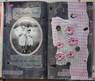
 So here we are at week 4 of The Summer of Color with Charcoal Grey & Pale Pink. A much easier set of colors for me.
I had a bit of a hard time getting the right grey until I read on Elizabeth’s post that she puts a little purple into her grey’s to give it more intense color. It worked!! So happy….thanks E!
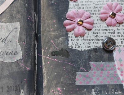
I’ve been doing a lot with splattering paint and inks lately. It seems to add the texture I’m seeking.
I have to admit that this shot with those colors makes me think 1980’s…”like totally“. There are parts of the 1980’s worth reliving…
I’m also loving the texture I pressed into the grey. I was actually trying to stamp some black texture into it but the paint was still too wet. I decided to run with it.
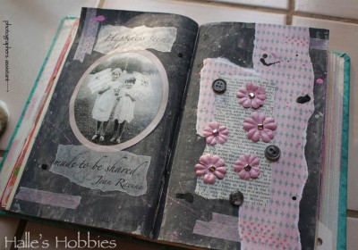
I had some “help” taking my photos this morning…
I’m glad I was able to help with the color, because you got a perfect charcoal grey to pair with that pink. The splatters are great. Wish I’d thought of splatters. And of course, your composition was super, too. A lovely, very elegant, feminine entry for SOC week 4.
Beautiful pages. Grey is such a soft color.
Very nice page. Great work.
Beautiful page, love the pink splatters on the grey background.
xx
Perfect Gray and Pink … your splatters sure are a super finishing touch to your work Halle!
Love these!
Oh my, these spread steal my heart!. Totally gorgeous 🙂
xo
I love the spattered paint and your colors turned out so vibrant. Beautiful use of the color combo.
I love it! Sweet and with contrast, perfectly! Love the texture. Happy SOC to you!
A great layout and I use a touch of purple in my Payne’s grey all the time… it just warms it up… happy week 4
These are amazing journal pages so beautifully crafted!
I just love your art journal pages! Your photo is wonderful, and you used this week’s SOC colors beautifully!!!!
I thought the tip about the purple was stunning as well. 🙂 Love all the layers and dimension on the page and gorgeous image that you used.