Here we are at the end of 2018. Time to take a look back at the year and discover the highlights.
Such as my word of the year…Discover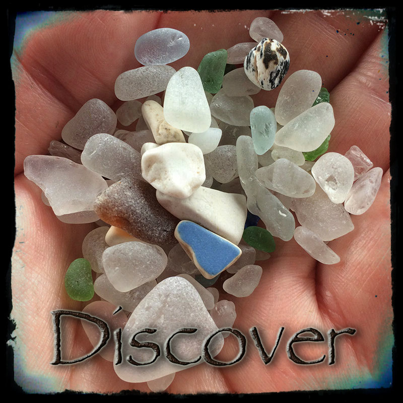
Looking back I’d have to say that I made some discoveries along the way.
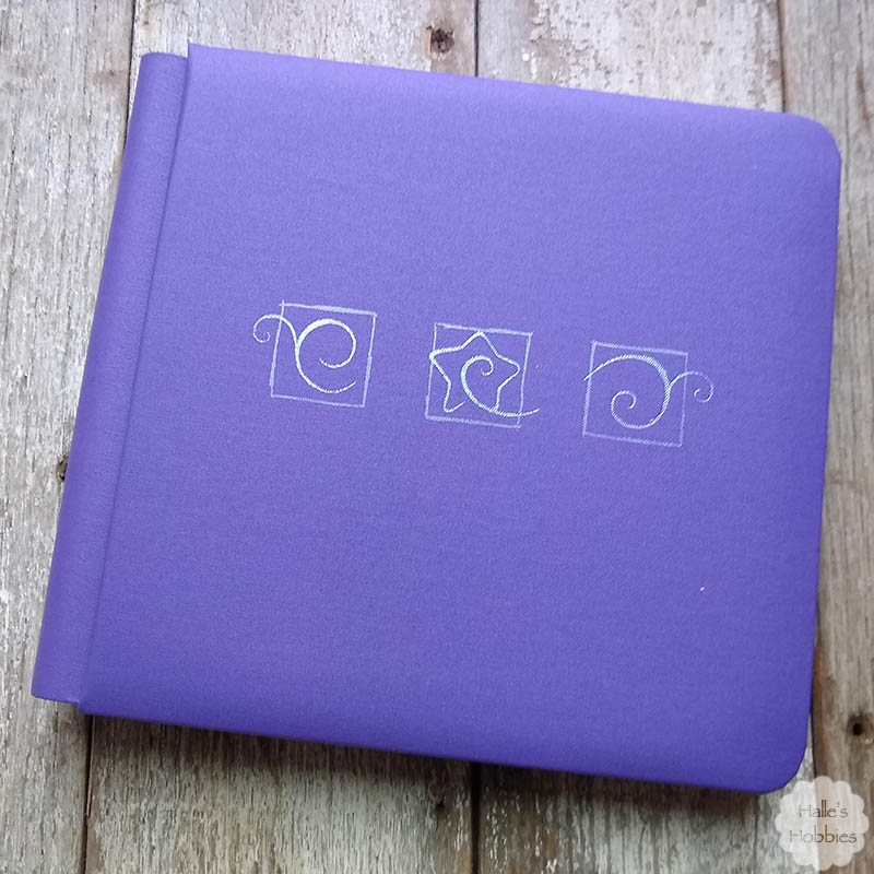
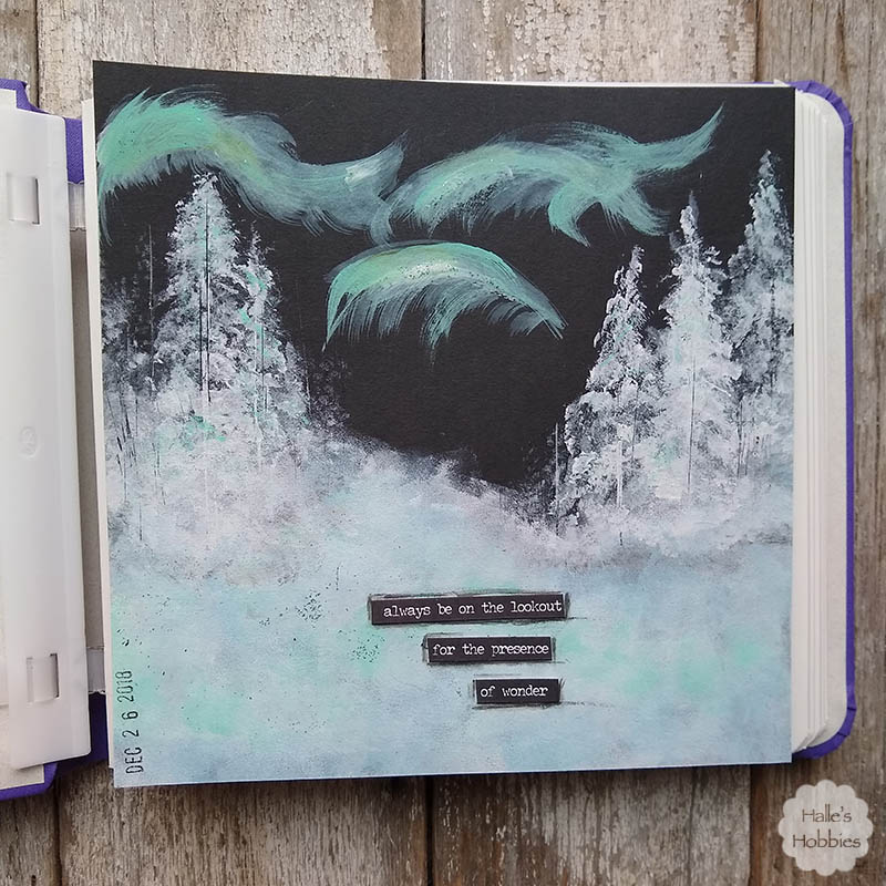
I discovered a new type of journal keeping that gives me the freedom to do what I want. Not a rigid everyday, writing only journal.
I discovered that I like like making videos of my creations. Not sure where this will go but it’s fun nonetheless.
I discovered how much I love my job now in year 2 back to work. Developing relationships with those crazy kiddos whether they are “mine” or not has been amazing.
Another big discovery was learning to let go of the things I can’t control. This is a work in progress…
I discovered… I am strong, I’m funny, I am clever & creative and I am uniquely me.
I am also a Norwegian from the Mid-west and those statements are as close to boasting about oneself as I dare tread.
I thought I’d share a couple of collages of the important things of my year….from both my personal and artsy/crafsy sides.
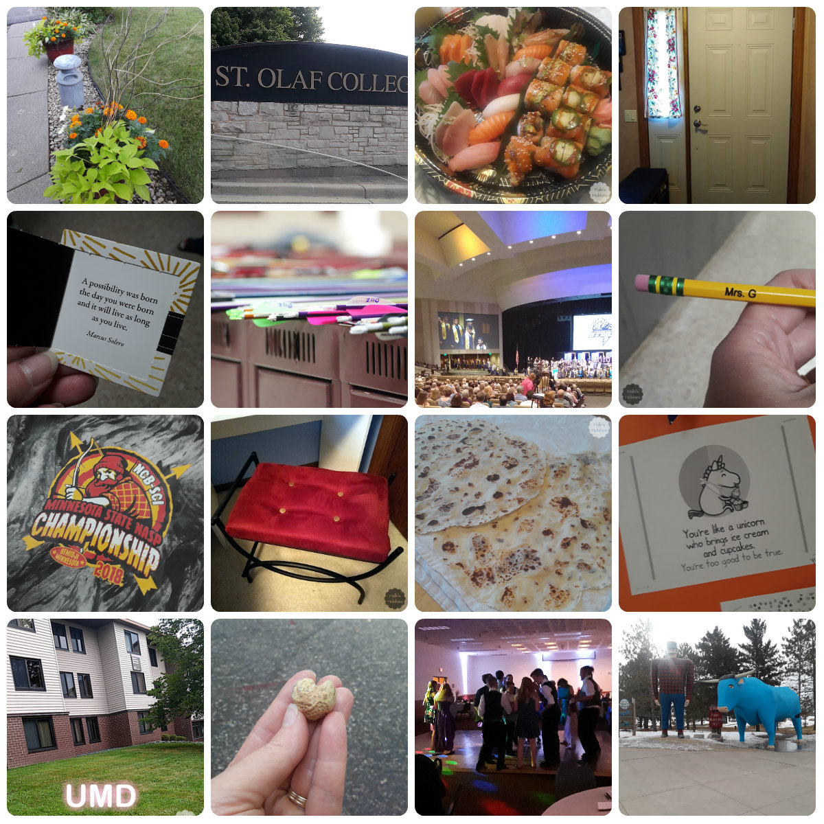
Events, travels, triumphs and good clean fun.
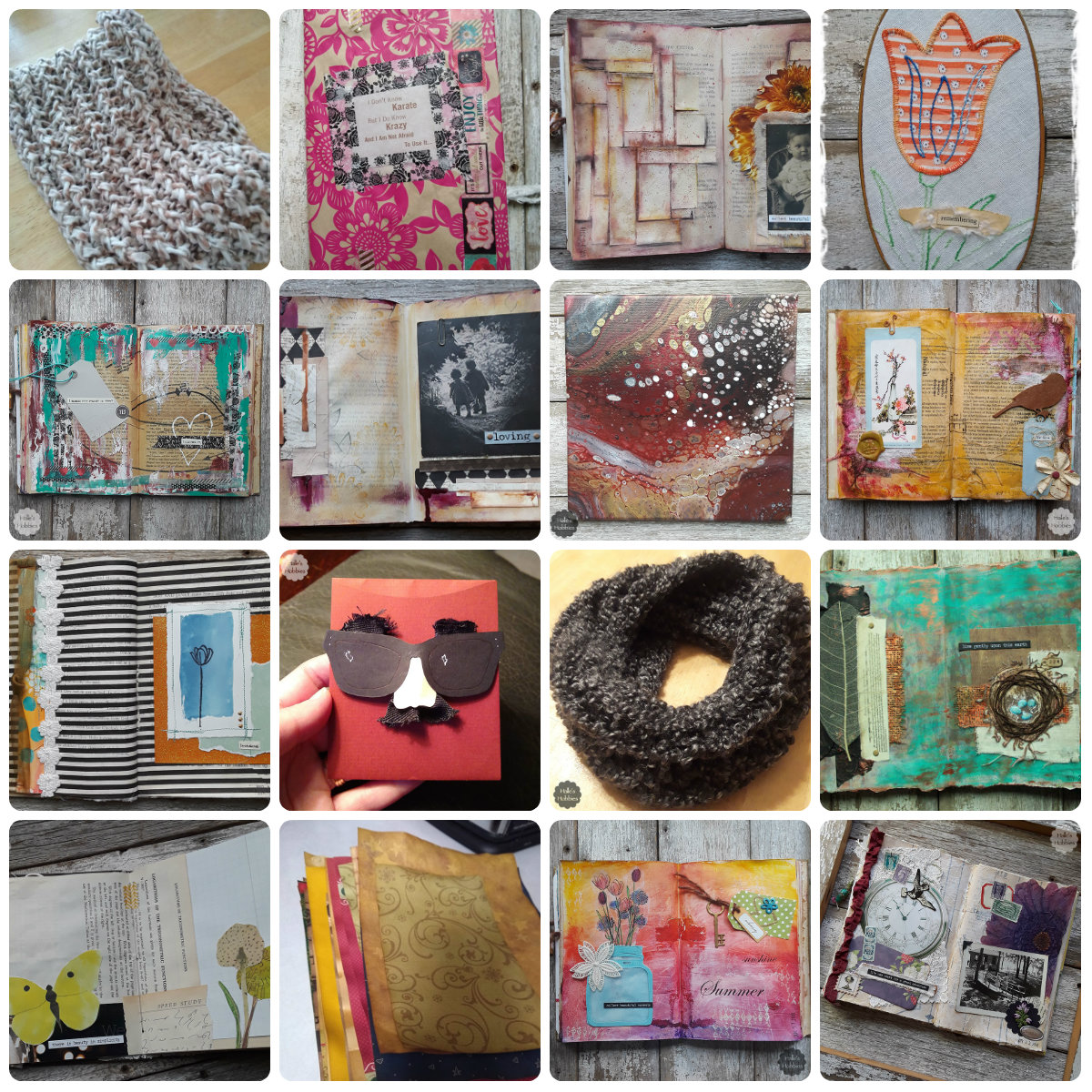
So many crafts…so little time.
Now I look forward to what 2019 has in store for me. Stay tuned tomorrow for the reveal of my 2019 Word of the Year.