 It’s time play along again with Kristen for week 2 of The Summer of Color.
The palette for this week is: Coral & Teal
with a Smudge, Splash or Pop of Bright White
This one was a little out of my comfort zone but that’s what this challenge is all about.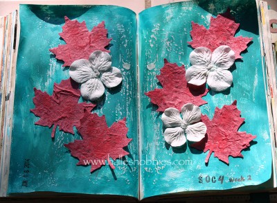 You’ll just have to take my word for it that the coral is more coral. I took over a dozen photos and played with them in Photoshop trying to get a realistic color representation of the real page but it was not meant to be today. My photo mojo is gone.
Thanks to everyone who stopped by over the past week to check out and comment on my week 1 entry. I’m hoping to make it around to everyone this week but I won’t make any promises.
This has such a fresh feel to it. I can smell the scent of damp and earthy notes as well as fresh floral notes, beautiful!
Halle, your pages are lovely! I can’t believe you’re done already. I have just seen the post and now have to go to work for the day! I thought this time I’d get a jump on visiting some of the participants since it didn’t go too well trying to do it all on a Sunday! I doubt it’s your photo mojo – it just seems like some colours don’t show up as “true” as others and sometimes I think it may have something to do with the other colours they are shown with. Anyway, they look lovely and vibrant and I’m feeling inspired!
These pages are lovely. I am impressed with the leaves. Very nice indeed
Great journal pages, love the white flowers, they add just the right amount of pop 🙂 xxx
lovely ~
Adorable!
Photo mojo? Got a laugh at that one. Clever. Are you using a photo box? I think I need to make one for my art because the colors are hard to show realistically It may have to do with your setup, or it may be what Cindy suggested. Regardless, this is a really pretty spread and looks very Canadian (grin). You must have been up early and worked quickly, too, since I started as soon as the colors were announced and I am sure you were sleeping at that time of day.
This looks beautiful. I love the white in the center and the beautiful colors all around. Reminds me of a mermaid’s favorite picture book.
Your journal page turned out fantastic! You are sure fast in posting. It’s going to take me some time to mix colors together to get the right hues!
HuGGs!
Debi
Just a wonderful texture! Very well done and original!
The coral colour looks fine to me, it’s coral. I like your fresh and cheerful pages.
lovely pages!
xo
Beautiful pages, love the leaves!
A lovely representation of nature and the colors. I agree that sometimes it’s hard to capture the actual colors in a project. I also try to see everyone’s entries but wow- with so many it can be a bit difficult:) See you next week!
Wow – that was fast! I’m making a mermaid house or beach shack this week.
Rinda
great journal pages, the great thing about the challenge is that a step outside our comfort zone can create so many fabulous things!
Oh, this is so cool! For goodness sake, don’t worry about the color; photos are never exact! (Photoshop lover here, too!) Love the 3D elements on these pages. Beautifully done.
Super pages. : )
I chuckled (not at you, but at me) when you said “out of your comfort level”….anything paper or shall I say not beads is totally out of my realm! You did a beautiful job with this color challenge–love the dimension the leaves and flowers provide.
Oh this is really nice! The maple leaves look so lovely!
Great use of this week’s colors!!
I love the leaves 🙂
Lovely piece !
When I had my senior portrait taken, back in the day, my photographer advised me not to wear coral, because it’s so hard to get the color to look right in the print. I wonder what it is about coral…
Anyway, I love your journal pages! The leaves are so pretty and the texture is great.
Halle, I absolutely love your beautiful art journal pages. You used the colors in such a creative way!