• Art - Blog - Creativity

    Art for art’s sake

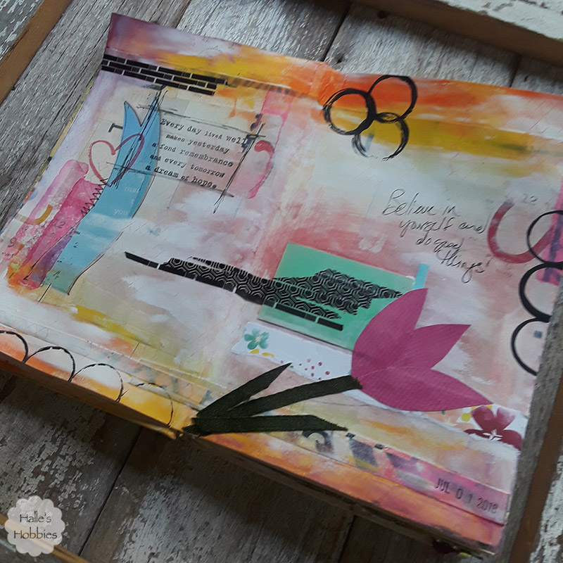
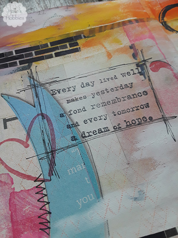
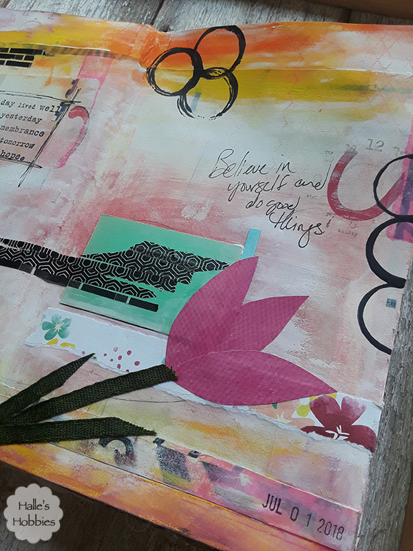
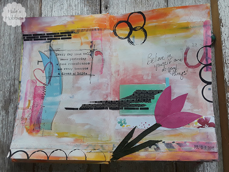
    Early Sunday morning I sat down to create. Getting my fingers full of paint and glue rejuvenates me. I used what was at hand.

     Scrapbook paper, magazine cuttings, ribbon and washi tape just to name a few.

    After creating this page I notice that the current theme for July on Art Journal Journey is Art for Art’s Sake hosted by Chris of Pearshapedcrafting. Don’t you just love it when things fall into place. It doesn’t always happen that so when it does…woohoo!

    Art Journal Journey


  • Art - Blog - Creativity

    Inspired by Summer

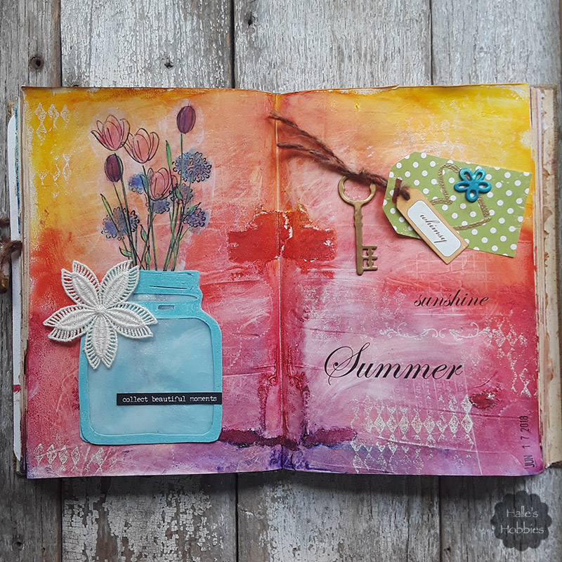
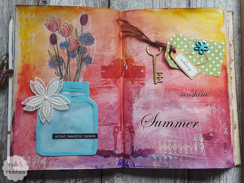
    As I sat down to create in the midst of a summer that I hadn’t planned, my mind wandered to the beautiful things. The things that make me appreciate summer. Beautiful colors. Flowers. Birds singing. Breeze blowing through open windows.
    All this had me in the mood for an explosion of color. I used my fingers to loosely apply paint in a tribute to a gorgeous sunrise or sunset. The colors were a little too bold. Too in your face so using a baby wipe I blended and softened the page until it made me happy.
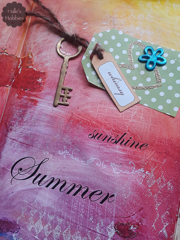
    I pressed uninked rubber stamps into the paint to create some interest on the background as the stamps pulled even more of the still wet paint away with them as you can see above with the grid pattern.
    After heat setting the page I used a harlequin stamp with white ink to lightly stamp randomly around the background using white embossing powder over top to provide a little more kick to the white.
    Digging through my stash I found some rub-ons that fit my theme perfectly. The black really pops against the background.
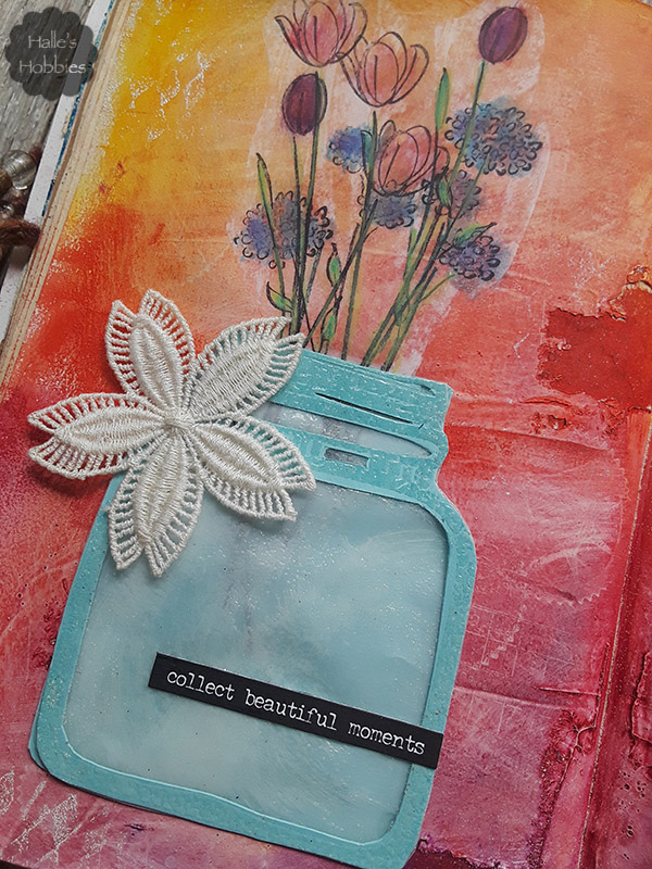
    A canning jar full of flowers screams summer beauty to me, Casual, simple, perfect.
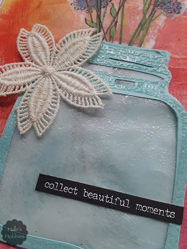
    I really wanted it to appear that these flowers were indeed inside a glass jar. This gave me a bit of a challenge.
    I stamped the jar twice. One was clear embossed for later use. The first was adhered directly to the page. I then stamped my bouquet of flowers onto tissue paper using black Staz-on ink. I adhered the tissue with matte medium and placed on the page, partially “inside” the jar.
    Next I cut out windows in the clear embossed jar. I cut a piece of vellum to fit and gave that a bit of shimmer with clear embossing as well. I carefully stacked and glued the pieces of the jar over the original stamped piece. Much to my great pleasure, the stems of the flowers shone through the “glass” as I had hoped.  I used a Tim Holtz word sticker to sum up my thoughts.
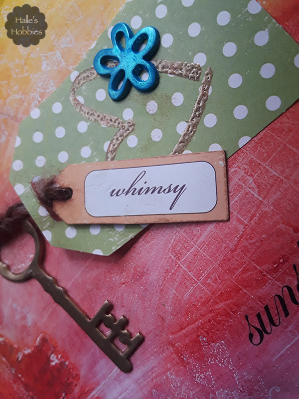
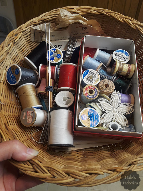
    The jar seemed to be missing something so I thought about the basket of goodies I carried home from a friends house like Little Red Riding Hood.
    The perfect embellishment was right there.
    I’m linking up today with Art Journal Journey for Inspired by… the theme chosen by this months host Gil from gibbyfrogettcraftations.
    Art Journal Journey
  • Art - Blog - Creativity

    Paint pouring process

    I know its taken a while but I’m finally going to show you how I do my acrylic pours.  (This is a photo heavy post)acrylic pour walk through
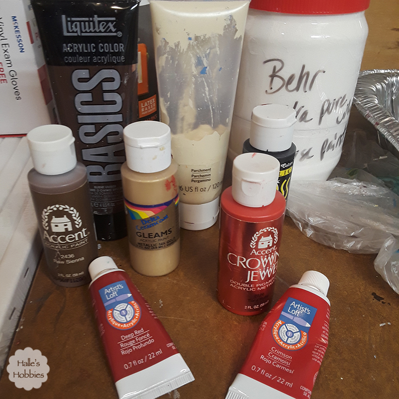
    Lets talk about the colors I used first off.  I use all brands of paint, even house paint for my pours. I really only care about the color I achieve in each cup. I mixed the 2 browns until the color felt right. I did the same with the 2 reds in the right of the photo.
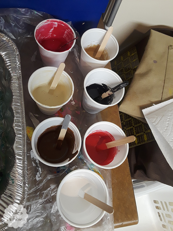
    acrylic pour walk through

    In all I have 7 colors. As I’m mixing these I add a product called Floetrol, which is a paint conditioner. I plan to use some of this in my paint for the front door…hopefully eliminating my brush strokes.
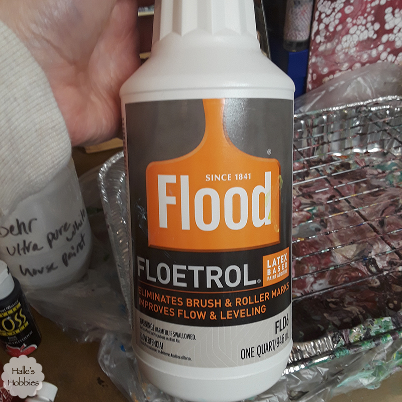
    acrylic pour walk through I use about a 50/50 mix of paint and Floetrol. I eyeball it…this girl doesn’t measure. If the paint is still quite thick (which is almost always is) I add distilled water very slowly until I get the proper consistency. For me that is the paint running in a thin line from my stir stick. acrylic pour walk through
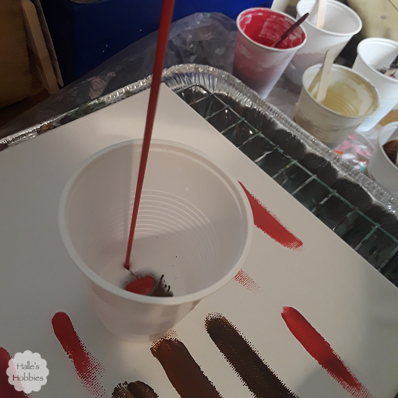
    Now comes the dirty pour part. I always start with a small amount of white in the bottom of the cup then begin adding streams of color in a varied order. I pour from different heights which distributes the color in the cup in different ways.acrylic pour walk through
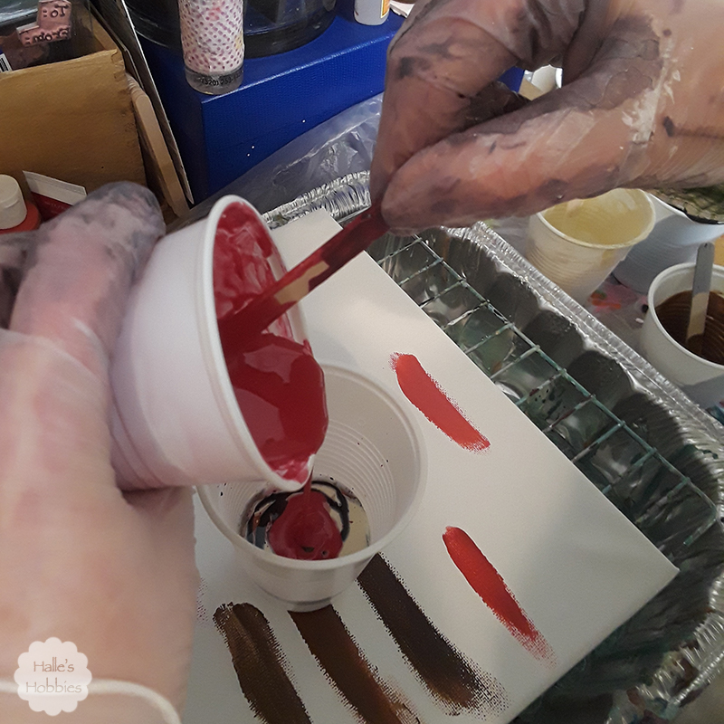
    As you can see I tried out colors from my paint drawer on the canvas before preparing my cups. It doesn’t matter what is on the canvas before so feel free to reuse an old canvas. After filling the cup with enough paint or what I assume is enough…remembering that some paint will be poured off the edge in this process….I’m ready to pour or flip as the case may be.acrylic pour walk through
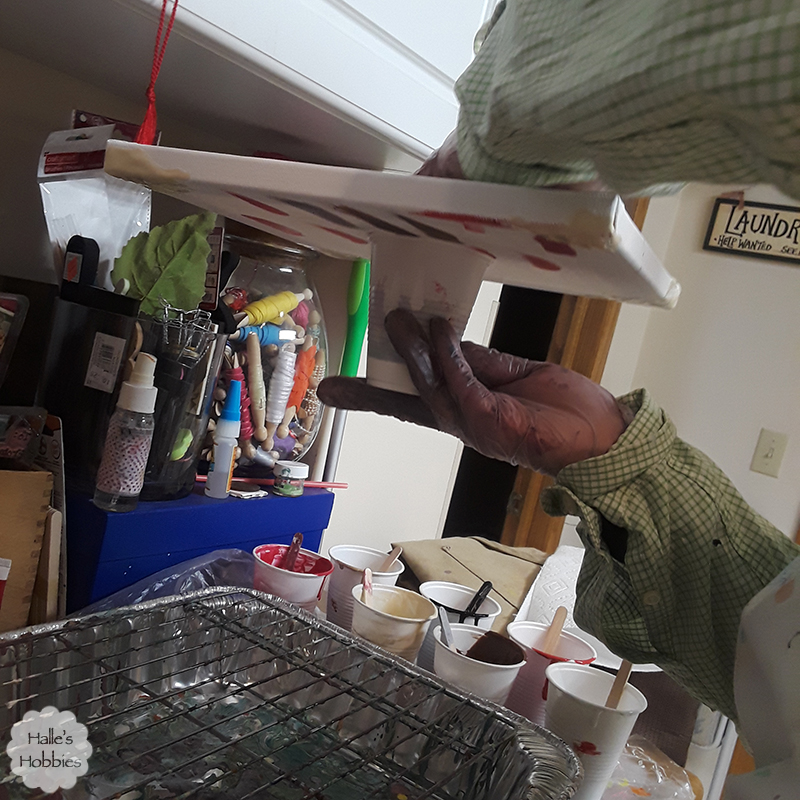
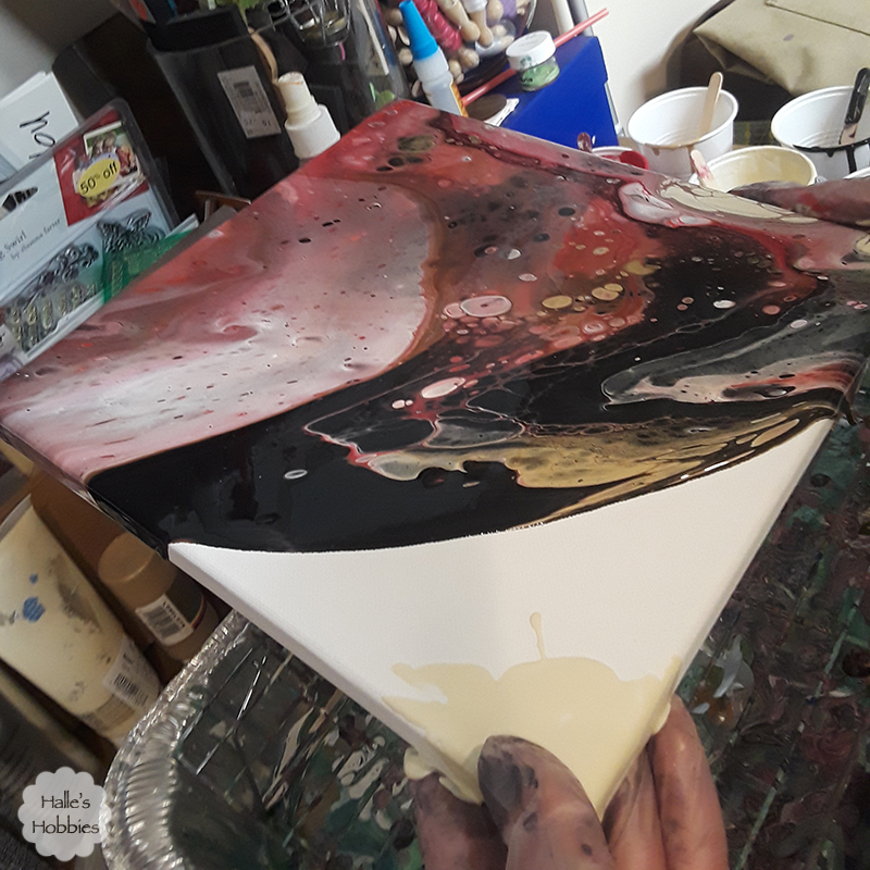
    Some people quickly flip the cup over onto the canvas…I have yet to be brave enough to do that since I am working in such a small space. Instead I flip with canvas over.acrylic pour walk through
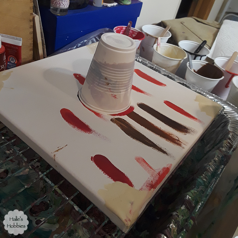
    And now we wait a minute or so for the paint to settle. Not sure how necessary this is but its the way I do it. I also tend to put a little paint at the corners to get the pour to flow over the edge quicker.acrylic pour walk through
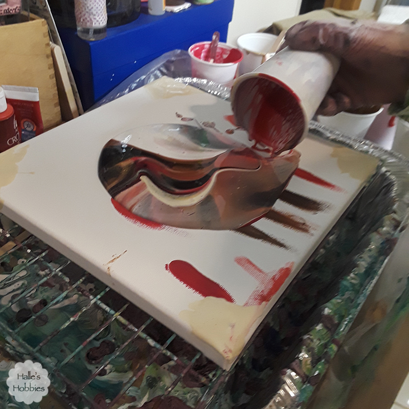
    Every time I’m amazed by the designs that come straight from the cup.acrylic pour walk through
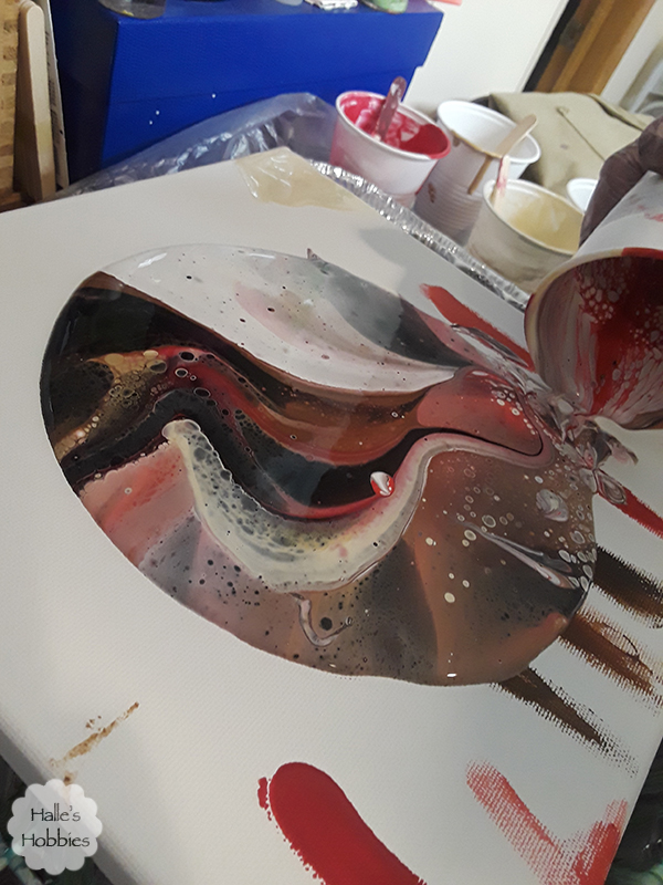
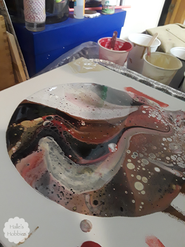
    Already cells are forming from the paint bubbling up and popping. No silicone used or needed.
    acrylic pour walk through

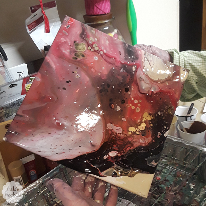
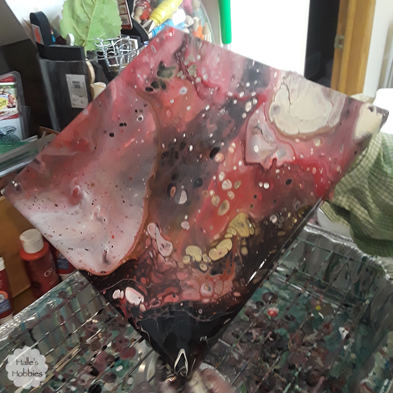
    I sometimes lightly blow on the paint to pop the surface bubbles before tilting the canvas to begin the flow.acrylic pour walk through
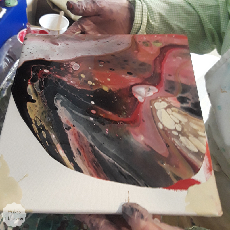
    acrylic pour walk through

    acrylic pour walk through

    acrylic pour walk through

    So much fun!!acrylic pour walk through

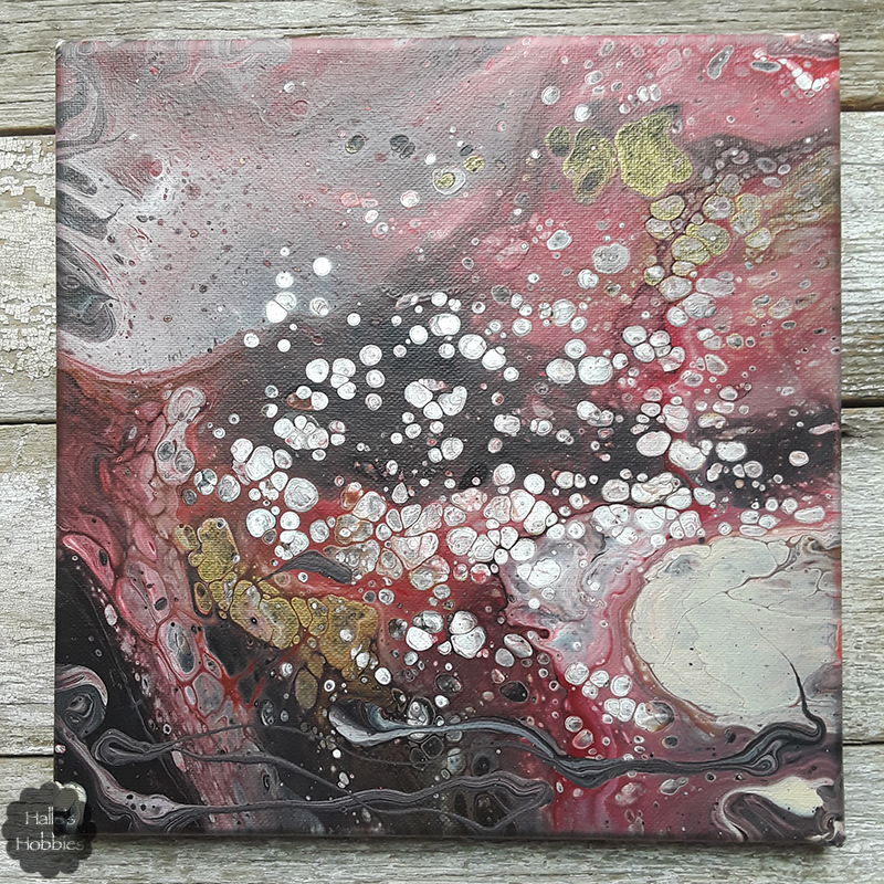
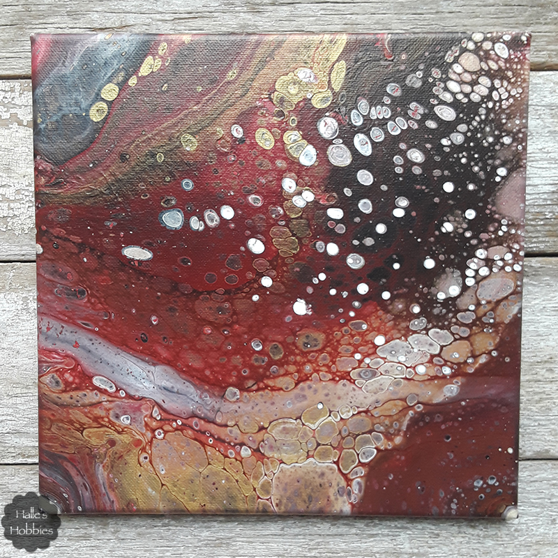
    Here is the completely dry canvas. I did drizzle some paint left in the cup at the bottom of the canvas to add interest. Not sure if I entirely like that addition but its all a grand experiment.

    Here is the second one I did with the same colors.
    acrylic pour walk through

    Crazy how different they are from each other. I love this this one…so does Mini-me. The colors work as a perfect accent in her room which was why I used them in the first place.

    Special thanks to Mini-me for her photography during the process.